Paluxy Pastures Farm - BrandGuide
Paluxy Pasture Farms, located in Texas, focuses on permaculture farming, providing sustainable, locally-grown food to their community. They’re deeply committed to values like community, quality, and environmental stewardship.
Our goal for their project was to create a unified brand identity that captures their permaculture principles, aligns with their values, and helps them stand out in the market.
3X Your Brand's Online Engagement
----------------------------------------------------------------
Send inquiry to: 📨 hello@sharkfold.com
or visit our website: 🌐 sharkfold.com
To create a brand identity that truly resonates with Paluxy Pasture Farms, we started by diving into their story—exploring their rich history, permaculture values, and connection to the local Texas culture. This research helped us understand their commitment to sustainability and community, and we aligned these insights with market trends to emphasize what makes them unique.
From there, we designed logo concepts inspired by Texas’ pastoral charm, using elements like earthy tones and balanced typography to capture their essence. Throughout the process, we worked closely with the client, refining the designs based on their feedback to ensure the final brand guideline perfectly reflects their identity and values.
From there, we designed logo concepts inspired by Texas’ pastoral charm, using elements like earthy tones and balanced typography to capture their essence. Throughout the process, we worked closely with the client, refining the designs based on their feedback to ensure the final brand guideline perfectly reflects their identity and values.
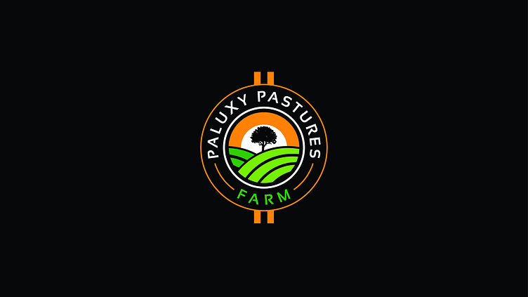
The logo for Paluxy Pasture Farms draws inspiration from the natural elements of permaculture, with the central tree symbolizing sustainability and growth, vibrant green fields representing the farm’s dedication to regenerative agriculture, and the warm orange sun reflecting Texas’ rustic charm and energy.
We’ve got grey, white, and black versions of the logo to make sure it looks great on all kinds of backgrounds and materials. These variations keep the brand’s feel intact while giving us more flexibility in how we use it.
In the logo usage section, we’ve set rules for the minimum and maximum width to make sure the logo is always clear and easy to read. We’ve also added exclusion zones around it so there’s enough space and nothing gets too close, keeping it looking clean and easy to recognize in every use.
3X Your Brand's Online Engagement
----------------------------------------------------------------
Send inquiry to: 📨 hello@sharkfold.com
or visit our website: 🌐 sharkfold.com
We’ve chosen Sensation Bold for the typography because it’s strong, modern, and easy to read, giving the brand a bold, confident feel. Its clean lines complement the farm’s rustic yet contemporary vibe perfectly.
The primary colors for Paluxy Pasture Farms are warm orange, bold black, and shades of green. The orange brings in the energy and warmth of Texas, while the black gives the logo a strong, grounded feel. The greens represent the farm’s focus on sustainability—light green feels fresh and vibrant, and dark green adds a sense of stability. White is used to keep everything balanced and make the colors pop.
3X Your Brand's Online Engagement
----------------------------------------------------------------
Send inquiry to: 📨 hello@sharkfold.com
or visit our website: 🌐 sharkfold.com
We’ve shown the brand applied to three different materials.
Business Card: The business card example highlights the logo, colors, and typography in a compact, professional layout. It’s designed to be memorable and easy to read, making a strong first impression.
Facebook Cover: The Facebook cover shows how the brand fits into the digital world. It uses the logo and colors to create a welcoming, cohesive look that feels true to the brand, giving it a consistent and friendly online presence.
4o mini
Letterhead & Envelope: The letterhead and envelope examples show the brand’s use in official correspondence. The design keeps things clean and professional, while the logo and colors add personality and recognition to the materials.
We added a glossary to make sure everyone is on the same page with the branding terms used in the guideline. It helps clarify key concepts and ensures consistency when applying the brand across different platforms and materials.
Since launching the new brand identity, Paluxy Pasture Farms has seen a 30% jump in social media engagement, with many customers praising the fresh, professional look. The new guidelines have also helped keep things consistent, with 95% of their materials sticking to the updated design, boosting their presence both online and in the local community.
3X Your Brand's Online Engagement
----------------------------------------------------------------
Send inquiry to: 📨 hello@sharkfold.com
or visit our website: 🌐 sharkfold.com


