Onboarding flow
Hey guys!
Introducing the onboarding flow for Chippie Count, a user-friendly calorie tracker designed to help users achieve their health goals with ease.
The goal for the onboarding flow of Chippie Count is to create a seamless and personalized experience from the very start.
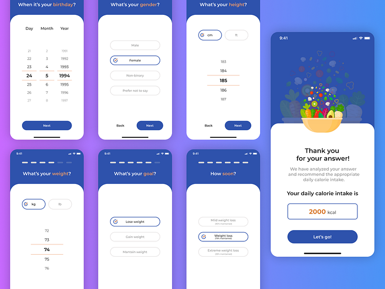
Users are guided through 7 simple steps, answering key questions about their birthday, gender, height, weight, health goals, and desired timeline.
Based on their inputs, the app instantly calculates and displays a personalized daily calorie intake, ensuring users have the right guidance to meet their fitness objectives.
This intuitive, user-friendly flow sets the stage for a positive and motivating journey toward health and wellness.✨
What makes this design stand out?
• Minimalistic Design: Clean and simple interfaces with clear typography and ample white space for a distraction-free experience.
• Guided Input Steps: Sequential questions, such as birthday, gender, height, and weight, ensure a personalized calorie recommendation.
• Clear Goals: Users can choose from different health objectives—lose weight, gain weight, or maintain weight—and define their desired timeline.
• Personalized Results: The flow ends with a tailored daily calorie intake suggestion, accompanied by cheerful and vibrant illustrations to celebrate progress.
🎨 Colors:
The design uses a calming blue palette as the dominant color, symbolizing trust and reliability. Accents of orange add energy and highlight key actions, while subtle hints of white create an airy, uncluttered feel.
The vibrant illustration at the end adds a pop of color, making the experience feel cheerful and rewarding.
💡 Feedback Welcome: I’d love to hear your thoughts on the overall flow, the choice of minimalistic elements, and how the color palette aligns with the app’s purpose.
Does the design feel intuitive and engaging?
Are there any areas where I could enhance clarity or user engagement?
Your feedback is invaluable in refining this design further!
