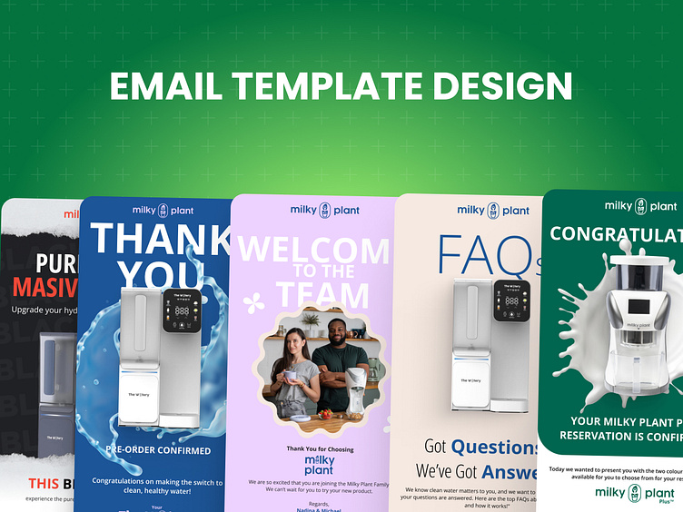
Email Designs: Milky Plant (Part 1)
Introduction
Creating a cohesive and visually appealing email campaign for Milky Plant and The Watery was a rewarding challenge. These designs aimed to enhance customer engagement, drive conversions, and establish a consistent brand voice. This presentation walks you through the design process, challenges encountered, and how these issues were resolved to deliver high-performing email templates.
1. Understanding the Client's Needs
Objective:
Develop a series of email templates for Milky Plant & The Watery, focusing on:
Promoting product features and benefits.
Driving customer engagement through compelling visuals and CTAs.
Ensuring compatibility with Klaviyo for smooth integration.
Research:
Explored the target audience: eco-conscious consumers interested in health, sustainability, and innovation.
Analyzed competitors' email marketing strategies to identify strengths and gaps.
Collaborated with the client to align on brand tone, visuals, and messaging.
2. Design Process
Phase 1: Ideation
Created wireframes for each email template to map out structure and flow.
Defined a visual hierarchy to ensure clarity and focus on key elements.
Phase 2: Visual Design
Used clean, minimalistic layouts to reflect the brand’s modern and sustainable ethos.
Incorporated brand colors (Milky Oat & Space Grey) for consistency.
Selected high-quality product visuals and lifestyle images to create emotional resonance.
Phase 3: Interactivity & Accessibility
Added hover effects to buttons and links for better engagement.
Ensured mobile-first responsiveness for seamless viewing across devices.
Added alt text to all images to improve accessibility and boost SEO.
3. Key Features of the Designs
Highlighting the Products:
Dedicated sections for product benefits (e.g., 99.9% contaminant removal, customizable milk recipes).
Used iconography and concise text to enhance readability.
Call-to-Actions (CTAs):
Strategically placed CTAs like “Shop Now” or “Reserve Today” to guide users toward conversion.
Designed buttons with a strong contrast and rounded edges for a modern look.
Promotional Offers:
Integrated exclusive discounts (e.g., 40% OFF) into visually distinct banners.
Used bold typography and accent colors to draw attention to time-sensitive deals.
4. Challenges & Solutions
Challenge 1: Tight Deadlines
Delivered the first batch of 12 templates within a compressed timeframe by prioritizing tasks and streamlining communication with the client.
Challenge 2: Missing Product Pages
Temporarily linked CTAs to the main website and ensured the links could be easily updated once dedicated product pages were live.
Challenge 3: Maintaining Consistency Across Designs
Developed a style guide to standardize typography, colors, and layout.
Regularly reviewed designs to ensure brand alignment.


