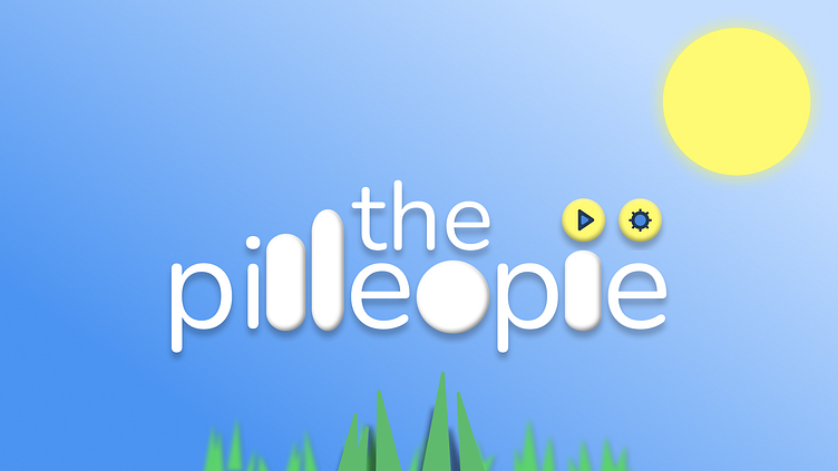
The Pilleople - A Game About Litle Pill People (Version 0.00)
The process for developing the game's logo was fairly simple. I decided to use one of two fonts already deemed in use: Nunito & Baloo.
The Logo
From possibly this and this to this...
The Icons
Even though they're just little pills, pilleople are expressive. What better way to show that than with icons. The freeform shapes were made from adjusting the splines and border-radius on 10-point stars. Circles have been said to make people happy. Shocked needed to be sharp and almost jarring, which is why it has a blue glow (blue for electricity) with deeper intersections and no shadows.
Even pilleople need romance. Different versions of the "Heart Icon" which is intended to be generated through a particle system for when pilleople are "in love".
White = familiar/friendly. Pink = love. Red = lust.
Pilleople Model Prototype
2D prototypes of the model used for the pilleople. Emotions (name, age, and gender on hover) shown above their heads. One even has vitiligo.
Fur Simulation
There are some strange, furry things happening here...
Check back later for an update!


