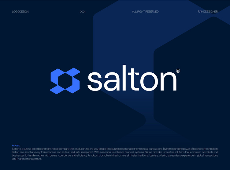
Salton® - Logo design for Blockchain Finance company - S Arrows
Designing the logo for Salton® was all about capturing their modern and trustworthy approach to blockchain finance. I combined the letter "S" with a sweep arrow to symbolize speed, progress, and innovation. The blue color was chosen to represent trust and technology, which align perfectly with their values.
From sketching ideas to refining the final design, I focused on creating something simple yet meaningful that works seamlessly across different platforms.
I’m excited to share this design with you all, Let me know what you think!
Press "L" to show your love ❤️️
______________________________________________________________________________________________
👉 Say goodbye to ineffective logos and hello to a design that’s both memorable and recognizable!🌟
📩 Available for new projects :
Email: info@rahidrehman.me
WhatsApp: https://wa.me/+8801705553455
Telegram: @rahiddesigner
💡 Follow for more update: Dribbble, Behance, Instagram, Twitter, Linkedin
© Rahid Rehman
