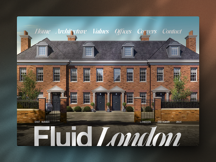
Architecture Firm Exploration
How do you make a creative studio’s website stand out without starting from scratch?
Websites for creative studios like Fluid London should inspire.
But when I scrolled through theirs, it felt it needed a redesign.
Most people think the solution is to add flashy animations or redesign every inch of the site.
But here’s the surprising part: it wasn’t the outdated look that held it back—it was how they were underusing their incredible visuals.
So instead of overhauling everything, I made their visuals the star.
I chose a striking photo that reflects their identity as an established London studio and positioned it front and center, giving the site depth and perspective.
Adjusting the photo’s colors made it pop, and clean, useful links enhanced navigation without stealing the spotlight.
The result?
A transformation that proves sometimes, leveraging what you already have can create the biggest impact.
What’s your take?
Would you have done it differently
