Packaging Designs vol1
This is our one stop destination for various packaging design projects that we have done over the years. Let's dive in!
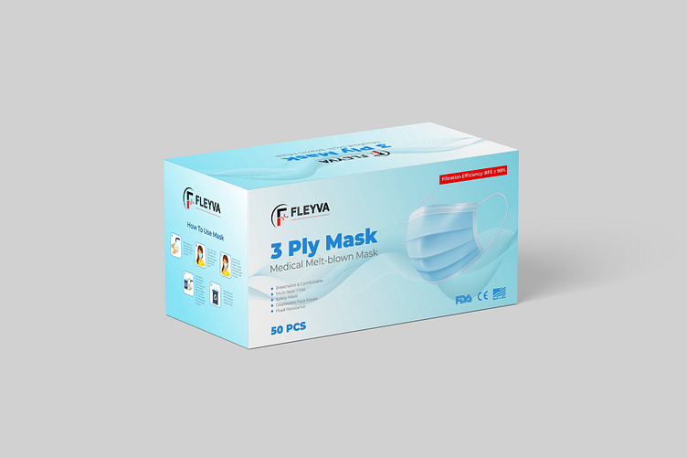
Medical Mask
Clear and Concise: The package shows an image of the product, along with the product name, type (3-ply medical), quantity (50 pcs), and brand (FLEYVA).
Visual Appeal: The design is visually appealing with a clean and modern aesthetic. The use of a light blue color scheme is calming and associated with cleanliness, which is relevant to the product.
Emphasis on quality: The mention of "Medical Melt-blown Mask" and the FDA and CE certifications highlight that the product is of high quality and meets safety standards.
A Great Product Needs a Great Package
---------------------------------------------------------------
Send inquiry to: 📨 hello@sharkfold.com
or visit our website: 🌐 sharkfold.com
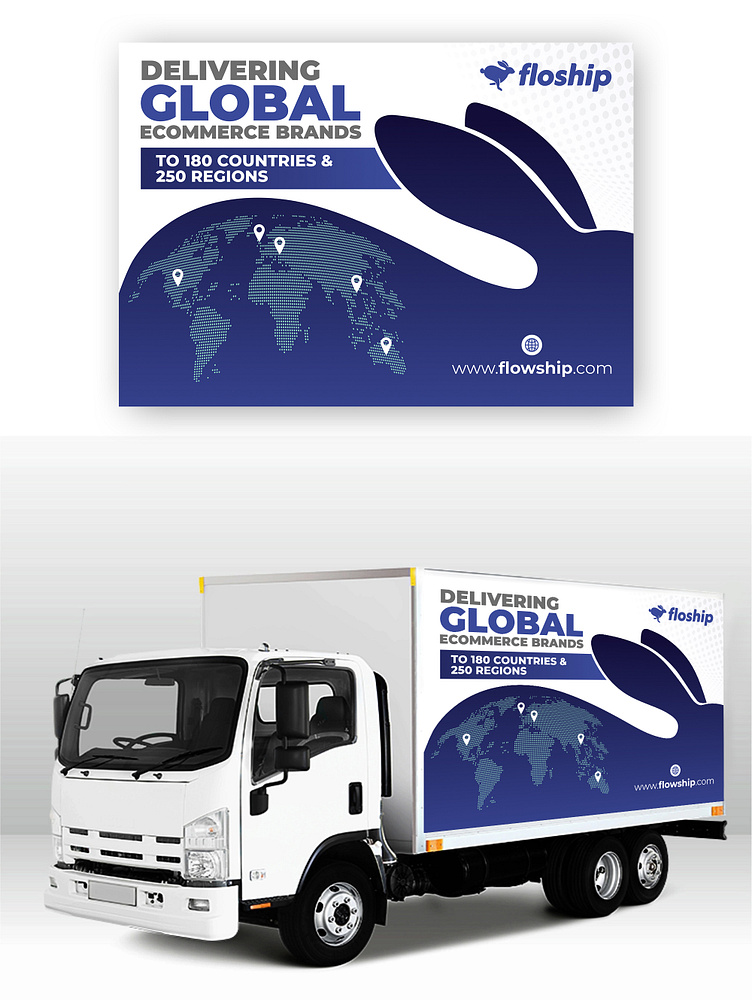
Floship Global Ecommerce Delivery Brand
Easy to understand: The design tells you exactly what the company does – it helps businesses reach customers all over the world!
Eye-catching and fun: The map and the cool bunny logo make the design really stand out and stick in your mind.
Looks trustworthy: The design gives you a good feeling about the company. It looks professional and like they know what they're doing!
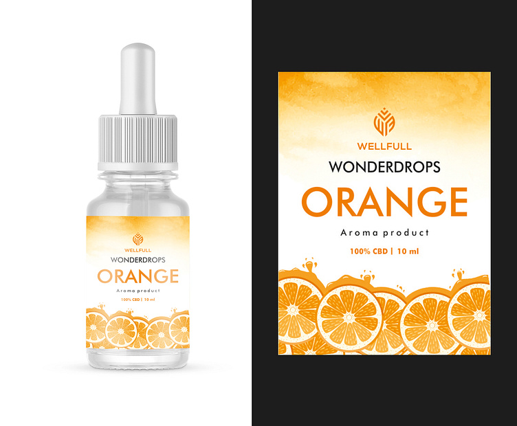
Wellfull CBD Aroma Products
Bright and cheerful: The label is full of sunny colors and juicy orange slices, making it look really inviting and appealing.
Simple and easy to read: The text is clear and easy to understand, so you know exactly what you're getting.
Looks natural and healthy: The design gives you the feeling that the product is made with natural ingredients and is good for you.
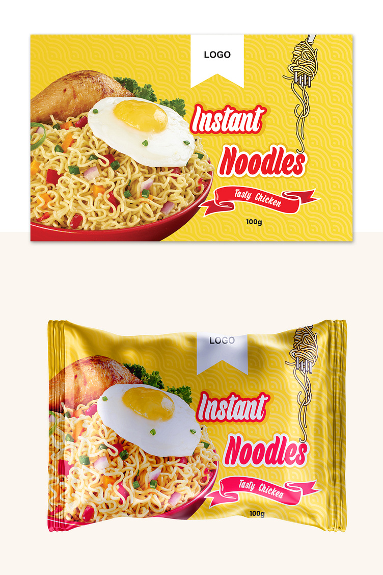
Instant Noodle Package
Visually Appealing: The design features vibrant colors and a high-quality image of the product to attract attention and create a sense of appetite.
Clear and Concise: The text is large, legible, and effectively tells buyers the product name and flavor.
Brand Consistency: The consistent use of the color scheme highlights brand identity and consistency.
A Great Product Needs a Great Package
---------------------------------------------------------------
Send inquiry to: 📨 hello@sharkfold.com
or visit our website: 🌐 sharkfold.com
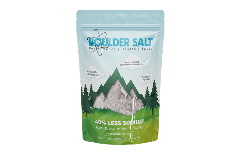
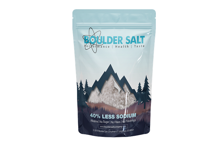
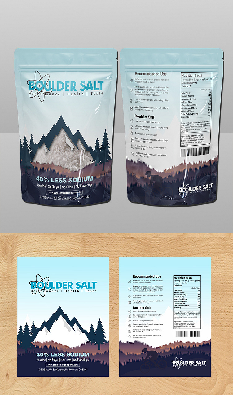
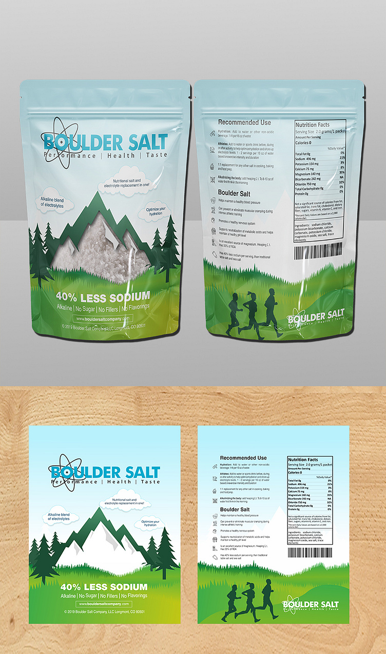
Boulder Salt
Clean & Modern Aesthetic: The design is clean and modern, with a light blue background and subtle mountain imagery conveying a sense of purity and naturalness.
Clear and Concise Messaging: The key benefits are highlighted prominently: "40% Less Sodium," and "Alkaline Blend of Electrolytes." This makes it easy for consumers to understand the product's value proposition.
Brand Identity: The logo and tagline are well-integrated into the design, creating a strong brand identity. The use of the atom symbol adds a touch of sophistication and suggests scientific backing.
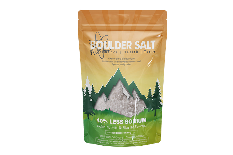
Practical and Functional: The packaging is a resealable pouch, which makes it convenient to store and use the product.
Informative and Trustworthy: The packaging has a list of ingredients and nutritional information, which builds trust with consumers who are concerned about what they are putting in their bodies. The mention of "No Sugar, No Fillers, No Flavorings" further emphasizes the product's natural and healthy qualities.
A Great Product Needs a Great Package
---------------------------------------------------------------
Send inquiry to: 📨 hello@sharkfold.com
or visit our website: 🌐 sharkfold.com
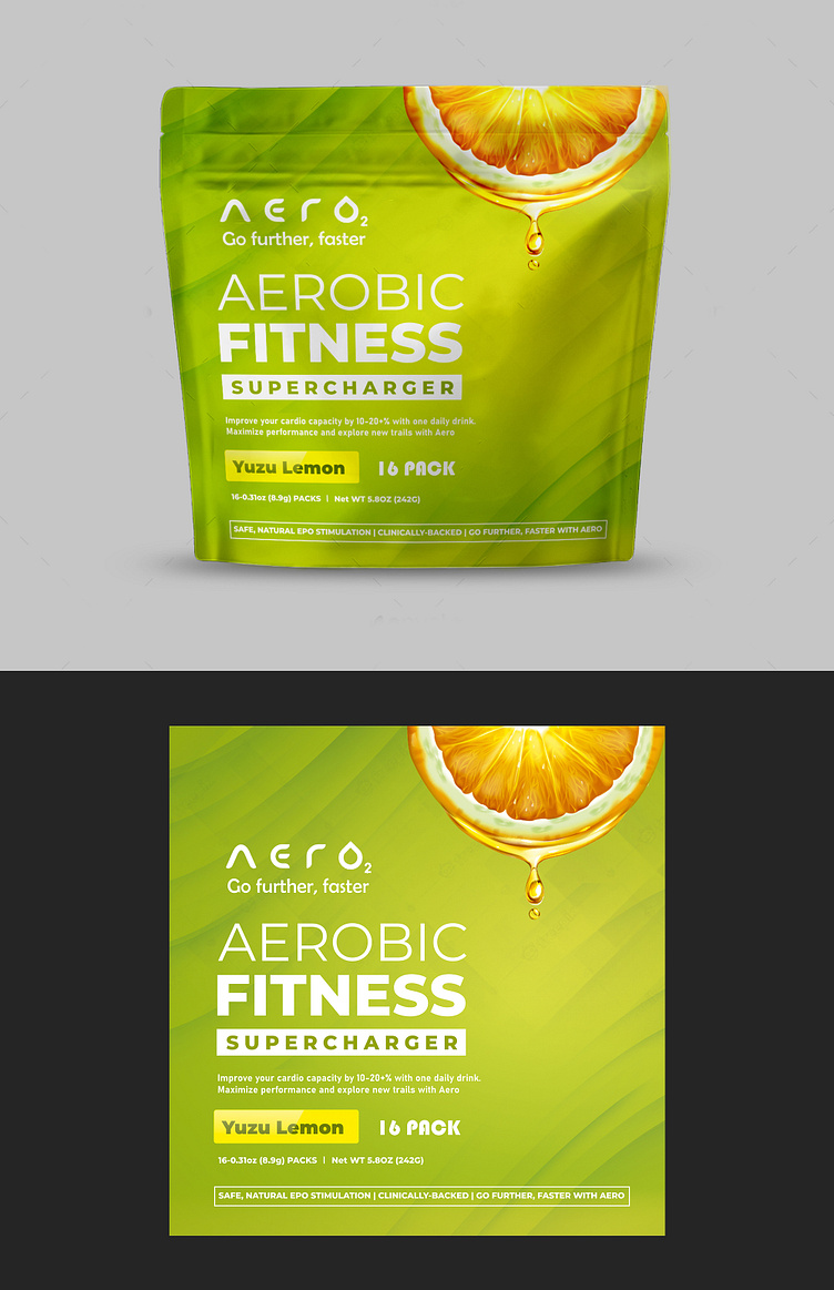
Aero Energy Drink Package
Target Audience: The package is designed for active individuals interested in working on their fitness. It appeals to those seeking natural and clinically-backed solutions to improve athletic performance.
Product Information: The design emphasizes the products ability-- "Go Further, Faster." It also highlights the use of safe, natural EPO stimulation and a refreshing Yuzu Lemon flavor.
Fresh & Energetic: The vibrant colors and citrus imagery creates a fresh and energetic look.
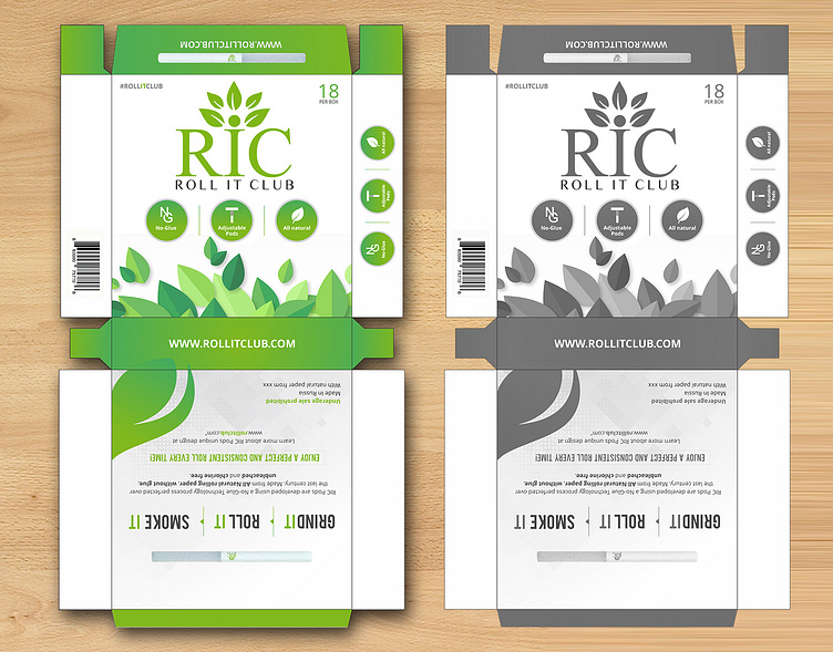
Roll It Club
Clean and Modern: The design is minimalist with a focus on the "RIC" logo and a color palette that portrays a sense of naturalness.
Informative: The packaging highlights key features like "No-Glue Technology," "All Natural Rolling Paper," and "Adjustable" design, providing valuable information to potential customers.
Branding: The use of the "ROLL IT CLUB" brand name and logo creates a consistent brand identity across the packaging.
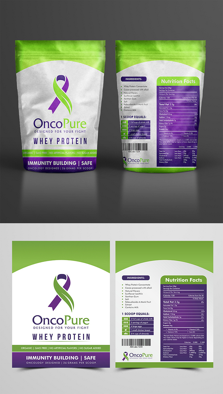
OncoPure Whey Protein Package
Color Palette: The striking contrast of purple and green instantly draws attention. Purple often symbolizes sophistication, while green represents growth, health, and nature. This combination creates a visually appealing and impactful package.
"Designed for Your Fight" Messaging: This tagline is powerful. It directly addresses the audience's personal journey and promotes the product as a supportive ally in their fight against cancer.
Subtle Symbolism: The inclusion of the ribbon symbol, often associated with cancer awareness, adds a layer of meaning.
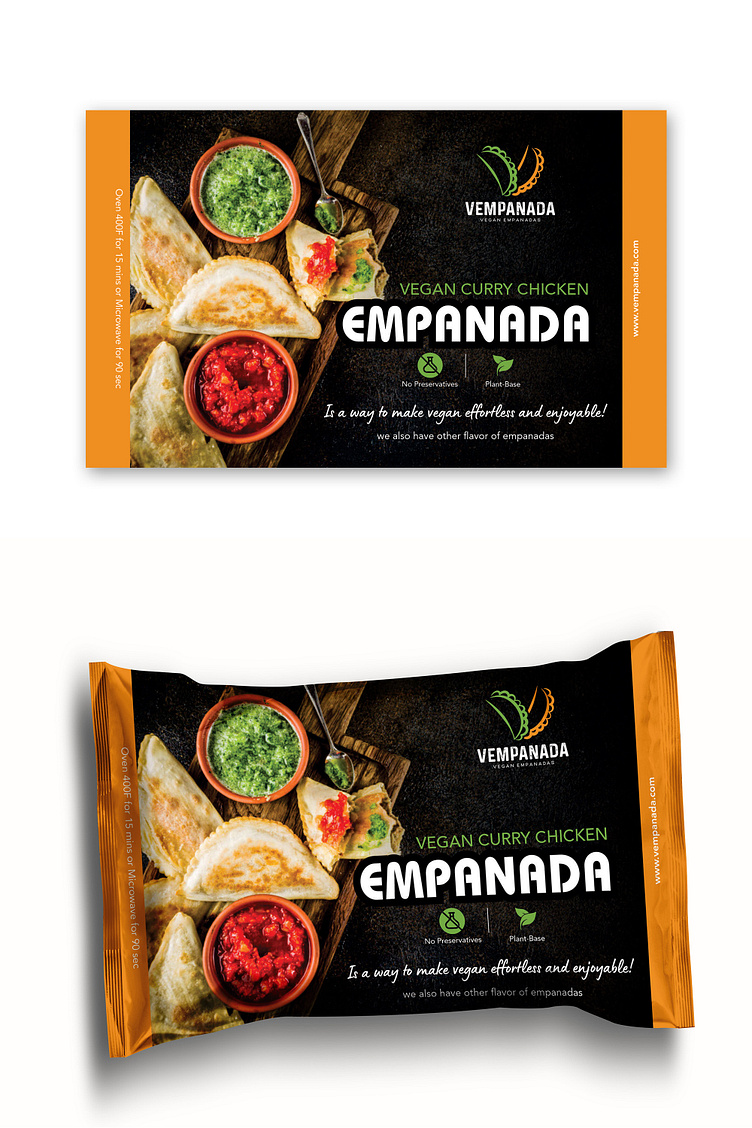
Vempanada Vegan Food Package
Mouthwatering Visuals: The vibrant image of the empanadas with colorful sauces is incredibly appetizing. It immediately draws the eye and makes the product look incredibly tempting.
"Effortless and Enjoyable" Messaging: This tagline perfectly captures the appeal of the product. It suggests that enjoying delicious food can be easy and hassle-free, which resonates with busy consumers.
Vegan Emphasis: The prominent vegan logo and explicit mention of "Vegan Curry Chicken" clearly target the growing vegan market. This positioning sets the product apart and appeals to health-conscious consumers.
A Great Product Needs a Great Package
---------------------------------------------------------------
Send inquiry to: 📨 hello@sharkfold.com
or visit our website: 🌐 sharkfold.com
