K Renovation Logo
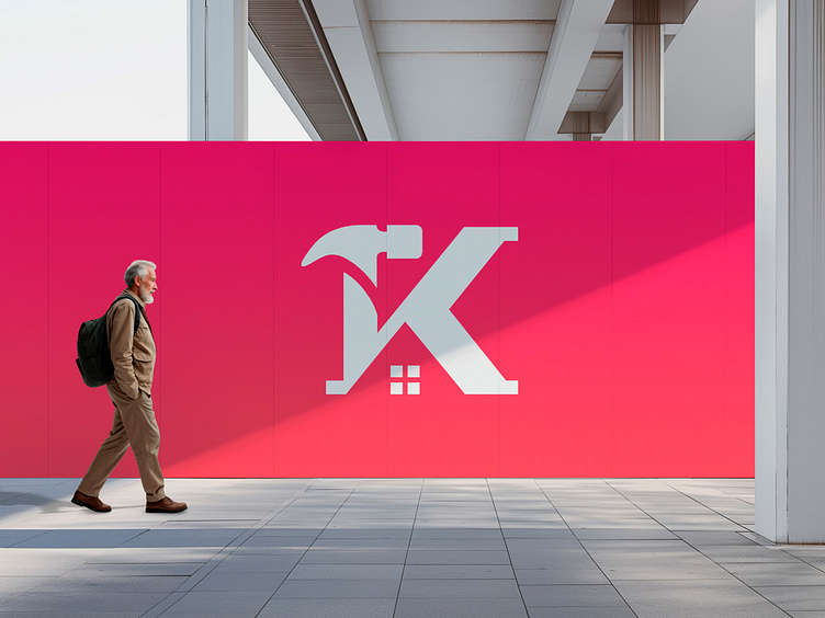
The K letter + hammer + home renovation logo combines the elements of craftsmanship, strength, and transformation to create a powerful visual representation of a renovation or construction business.
The logo features a bold and stylized letter "K" as its centerpiece. The letter has clean lines and sharp edges, representing precision and attention to detail in the renovation process. The strong and solid form of the letter conveys stability and reliability, reassuring clients
that their projects are in capable hands.
Incorporated within the letter "K" is a hammer, an iconic symbol of construction and renovation work. The hammer is positioned in a way that seamlessly integrates with the curves and angles of the letter, emphasizing the synergy between the craftsmanship and the brand identity. It symbolizes strength, durability, and the ability to build and reshape spaces.
Your brand’s story starts with its logo!
Let’s make it
unforgettable!
DM me or send an email
your next iconic logo is just a message away!
👉 daudhasan313@gmail.com
👉You can get my service on 👉 Linkedin
Or 👉 Freelancer.com
📖Read my Client's Recommendations
👍 Follow me on Instagram
👍Check out my Behance profile
👍 Follow me on Twitter
👍 Follow me on Pinterest
