Facility management website
A UX/UI Case Study
1. Problem Statement
SoSolutions, a facility management company based in Brussels, needed a new online presence that would:
Showcase their range of services (from maintenance to renovations) in a clear, user-friendly manner.
Attract both B2B and B2C clients by highlighting their tailored, high-quality solutions.
Build credibility in a highly competitive sector by presenting a modern, professional, and trustworthy brand image.
The main challenge was to create a design that conveyed both the breadth of services SoSolutions offers and the company’s reliability without overwhelming users.
2. Goals and Objectives
Inform and Educate: Provide detailed yet digestible information about SoSolutions’ facility management and specialised services.
Enhance Brand Image: Establish a clean, modern look that aligns with SoSolutions’ professionalism and expertise.
Improve User Experience: Ensure intuitive navigation and easy access to service details, contact forms, and resources.
Drive Conversions: Encourage inquiries and quote requests from potential clients through visible call-to-action buttons and streamlined contact forms.
3. Design Process
Even though there wasn’t a formal research phase, you applied best practices and a user-centered mindset:
Information Architecture
Analysed SoSolutions’ service offerings (Soft FM, Hard FM, renovations, cleaning, etc.) and grouped them into clear categories.
Ensured the navigation bar and drop-downs guide users to relevant information quickly (Services, Blog, Contact, etc.).
Wireframing & Layout
Sketched low-fidelity wireframes to outline key pages (Home, Services Overview, Individual Service Pages, Blog, Contact).
Focused on making critical user pathways (e.g., learning about a service → requesting a quote) straightforward.
Visual Design
Chose navy blue and yellow as primary colors to reflect reliability and energy.
Incorporated real imagery showcasing SoSolutions’ team and services to establish trust and relatability.
Kept typography clean and legible (e.g., a modern sans-serif for headings and body text).
Prototype & Feedback
Created interactive prototypes (clickable mockups) for stakeholders to visualise.
Gathered informal feedback on color palette, layout clarity, and overall brand consistency.
Iterated based on comments to refine the structure and styling.
4. Challenges and Constraints
Limited User Research
Due to time and budget constraints, the project lacked extensive user testing. Instead, relied on stakeholder input and design best practices.
Broad Service Offering
SoSolutions serves both corporate and residential clients, meaning the design had to appeal to different user personas while staying cohesive.
Tight Timeline
Balancing design, development, and content population within a relatively short delivery window.
Technical Considerations
Ensuring the website would be easy to maintain and update for SoSolutions, particularly for posting new blog articles and service updates.
5. Final Design
The final website features:
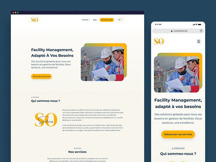
Homepage: Prominent hero section describing the company’s vision, a concise “About Us” excerpt, and quick links to core services.
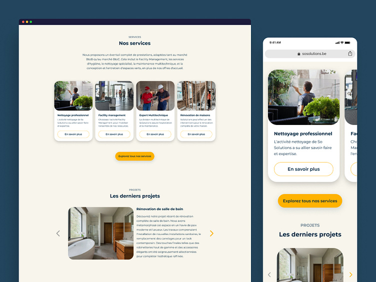
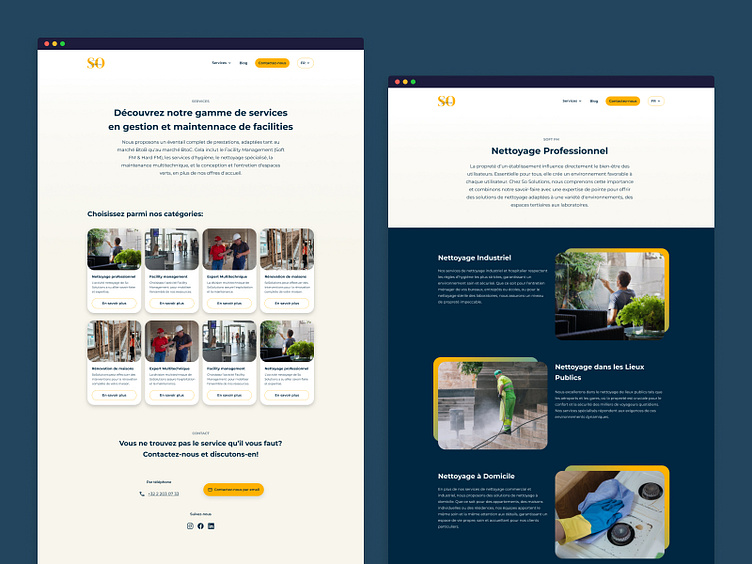
Services Overview: A grid of services with imagery and brief descriptions, leading to dedicated pages (e.g., Professional Cleaning, Facility Management, Renovation).
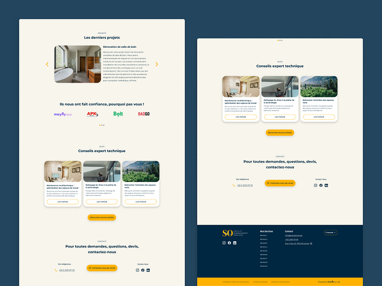
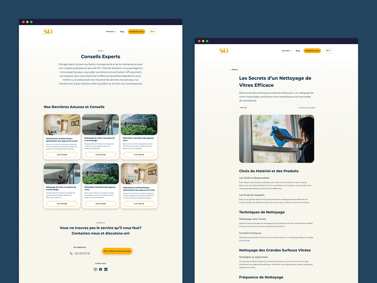
Blog Section (Conseils Experts): Educational articles on maintenance tips and facility management, establishing thought leadership.
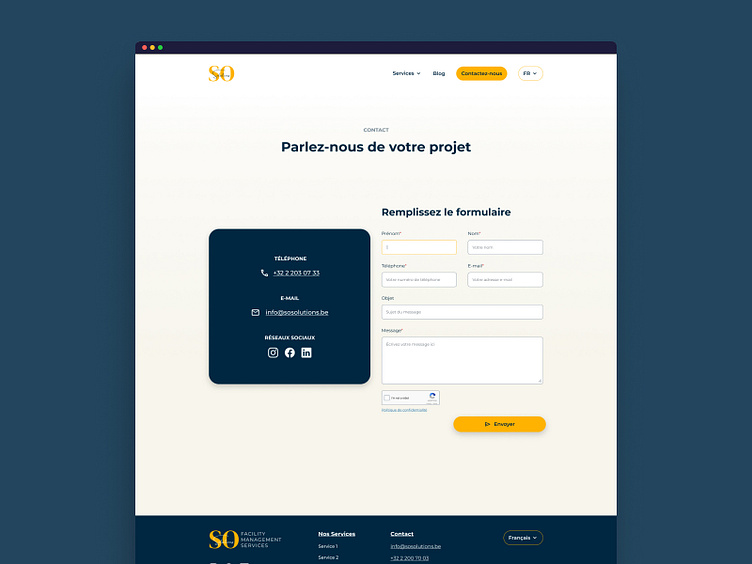
Contact Page: An easy-to-complete form with clear fields, plus direct contact information for immediate inquiries.
Consistent Branding: The navy-and-yellow palette with modern typography, reinforcing SoSolutions’ identity across desktop and mobile.
High-resolution images and iconography helped communicate the wide variety of facility management solutions, aiming to reassure potential clients about SoSolutions’ expertise.
6. Outcome
Improved Brand Presence: The professional, modern site design helped position SoSolutions as a reliable provider in facility management, catering to both private and public sectors.
Easier Customer Inquiries: Clear calls to action (e.g., “Contactez-nous” buttons, phone number, and email) simplified quote requests and boosted lead generation.
Positive Stakeholder Feedback: SoSolutions’ team appreciated the simplified structure and the visual impact of featuring real-life photos.
Flexibility for Future Growth: The website’s backend structure allows easy addition of new services or blog posts, enabling SoSolutions to keep content fresh and relevant.
Although there are no hard KPIs available at this stage, anecdotal evidence and stakeholder comments indicate that the new website has strengthened the company’s image and streamlined their online communication.
7. Reflection
What Worked:
A clear information hierarchy and consistent branding helped unify SoSolutions’ diverse service offerings.
Using real imagery established trust and authenticity.
Lessons Learned:
Even minimal user testing or feedback loops can significantly shape the design. Gathering quick feedback helped refine the final look and feel.
Working iteratively with stakeholders ensured alignment, but more direct user research could have revealed deeper insights into client needs.
Next Steps:
Incorporate more structured user testing to continuously improve user flows.
Track web analytics to measure lead conversions, page engagement, and time on site to make data-driven design updates.
