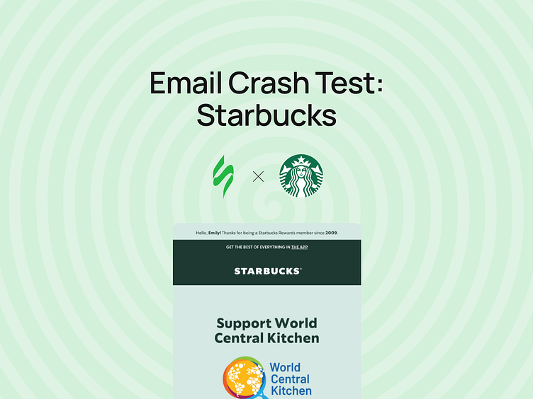
Email crash test: Starbucks
📩 Email Crash Test: Starbucks Edition!
Ever wondered how top brands like Starbucks maintain perfect email design every time? Let's break it down:
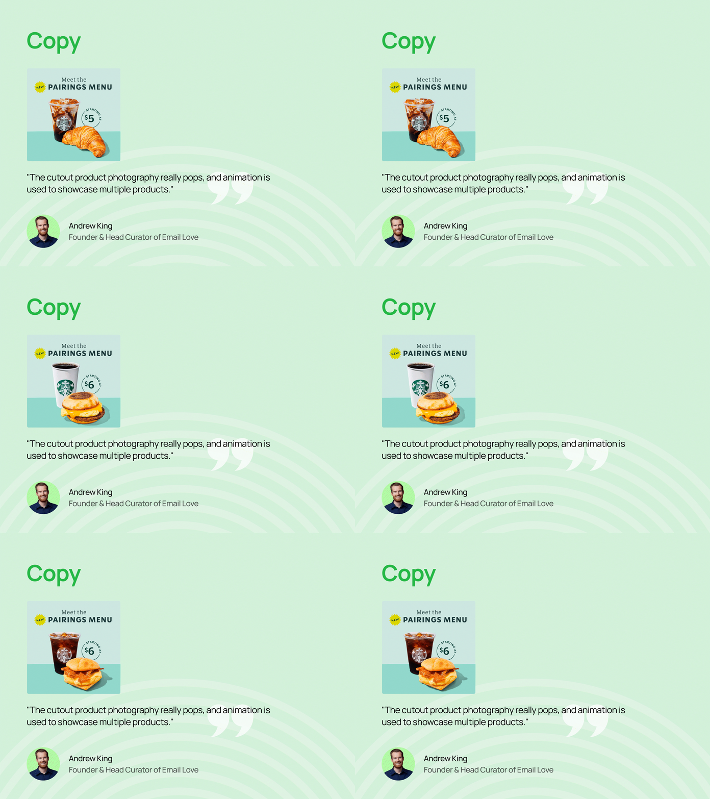
✅ Brand Consistency Starbucks nails the visuals — logo, corporate colors, fonts, and even the iconic cups stay the same across emails.
✅ Personal Touch They make sure each email feels just like their stores: warm, familiar, and consistent!
➡️ Want to see how they do it and learn how YOU can create similarly memorable emails? Check out our latest breakdown!
Thanks for checking it out! 🙌
Follow us & press "L" to show your love ❤️
We’d love to hear your thoughts! Drop a comment and let us know what you think.
More by Stripo Email View profile
Like


