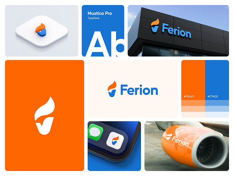
Ferion Logo Design | Airlines | Fuel Efficiency
Ferion: A New Era of Airlines Fuel Efficiency
Ferion is a symbol of aviation's future that represents innovation, sustainability, and progress. This design is made to represent the vital significance of fuel efficiency in the aviation industry, which is a key component in lowering carbon footprints and promoting environmentally friendly technology, in addition to driving cost savings.
The Ferion logo integrates sleek, dynamic lines that evoke the flow of air currents and the streamlined motion of modern aircraft. The subtle, upward angle suggests both upward mobility and sustainable progress—values at the core of our mission to transform the aviation industry.
With the Ferion logo, we aim to not only communicate cutting-edge fuel efficiency but also a vision of the aviation industry's greener, more sustainable future. 🌱✈️


