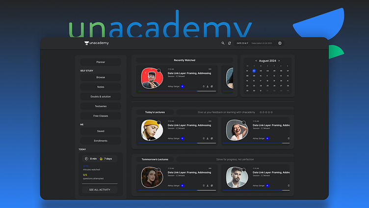
Unacademy Website Redesign
Process Overview:To ensure a seamless and impactful redesign for the Unacademy website, I followed a structured design process that began with wireframing. This approach helped establish a clear visual hierarchy and functionality blueprint before moving to the final design phase.
1. Wireframe Creation
I started by understanding the key user needs and objectives for the Unacademy platform. Using this insight, I crafted low-fidelity wireframes to map out the website’s structure and navigation flow. The focus was on creating a clean, intuitive layout that highlights essential elements such as course discovery, educator profiles, and user dashboards.
Key Features in the Wireframe:
Simplified navigation bar for quick access to courses and resources.
Centralized call-to-action buttons to boost user engagement.
Organized sections for user testimonials and trending courses.
2. Final Redesign
Once the wireframes were approved, I transitioned into creating the high-fidelity redesign. Using tools like Figma, I brought the wireframes to life with modern aesthetics, consistent branding, and interactive elements.
Highlights of the Redesigned Website:
A visually engaging homepage with vibrant colors and clear typography.
Enhanced usability with mobile-first responsive design.
Intuitive user interface that simplifies course enrollment and progress tracking.
Strategic use of whitespace to maintain focus on content and visuals.
By following this structured process, I ensured that the final redesign aligns with Unacademy's goals while providing an exceptional user experience.


