Analytics
daily #18
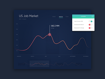
Interactive graph. I wanted to introduce a new way to adjust general date ranges, which is done here with a configurable slider widget at the bottom. UX needs work but it's something. Dropped the legend in the attachment for cleanliness.
More by Kyle Penn View profile
Like

