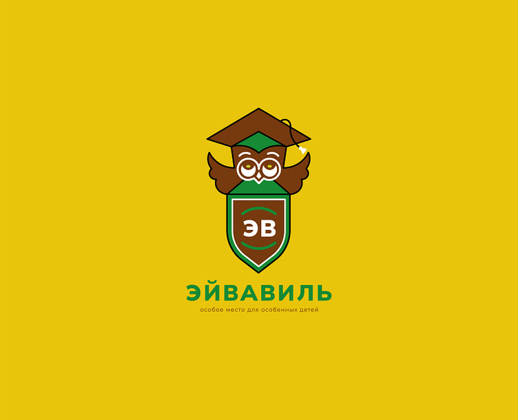
Corporate identity / Children's center / Logo / Logo
About the project:
Eyvaville. A special place for special children is a center for the development and adaptation of children with mental disabilities. An inclusive environment for children with autism, autism spectrum disorder (ASD), attention deficit hyperactivity disorder (ADHD), delayed psychoverbal development (ZPRR), delayed speech development (ZRR) and so on.
The name "Eyvaville" comes from the female name Eva, the meaning of which is "giving life, the beginning of life", transformed into "Eyva" (inspired by the film "Avatar", in which "Eyva" is the tree of life, family, strength).
The second part of the name "Vil" implies a house, a villa, a cozy corner.
Project history:
A customer contacted me, who has a daughter with autism, the girl's name is Eva.
A room was allocated for classes with Eva, which was visited by various specialists: neuropsychologists, speech therapists, massage therapists, art therapists, sensory integration therapists, adaptive physical education trainers, osteopaths. The specialists have been working with the girl for many years and have seen results.
The specialists were asked to bring their own children to classes. Parents of other children began to bring their children to classes, to find out what other developmental classes could be. Thus, interest was born on both sides, feedback was established.
There turned out to be many children with mental disabilities, so the issue of expanding and creating a full-fledged center became very relevant.
In the center, children with mental disabilities study with teachers, older children master self-service skills - learn to make their beds, fold their clothes, brush their teeth, comb their hair, cook basic food, and so on.
Thus, Eva inspired the creation of a center for children with special needs.
Eva is the face of the Eyvaville center.
Why I took on this project:
I have a higher education in social work. I have a bachelor's degree in social work and a master's degree in social work. I worked in a psychoneurological boarding school, I wrote a thesis about people with mental disorders. Therefore, knowing the psychophysiological characteristics of this category of people, I took on this project with great interest.
Solution:
Initially, there was a logo that was difficult to read and was not perceived as it should be.
Having saved the idea and laid down new meanings, I developed a new logo, which was unanimously accepted.
When I started developing the corporate identity, I knew that the most important thing was children. Therefore, the style, the execution of the corporate identity, was done as if the child himself drew it (children's clouds, check marks, lines, circles).
Three bright colors were taken as a basis, which are easily read by children: green (the color of beginnings, birth, nature, purity, naturalness), yellow (the color of positivity, mood, warmth, kindness), brown (the color of safety, support, protection, stability).
Considering that Eva is the face of the center, a photo of a girl with a magnifying glass, like an explorer, was chosen. Children study, explore the world, learn something new.
The following were developed within the framework of the project:
- logo;
- corporate identity;
- community design in VKontakte;
- Taplinka design;
- banners for the Telegram channel;
- advertising leaflets (horizontal and vertical);
- banner for the front door;
- banners for the website;
- entrance sign;
- entrance inscription;
- methodological manual;
- box for the methodological manual;
- package;
- product cards for Wildberries.
The logo has additional versions:
The main (vertical) version is the version that was developed first.
It is appropriate to use it on documents, signs, and official products.
The horizontal version is the version that is appropriate to use on websites and where the main version is not suitable in terms of proportions.
The shortened version is the version that is appropriate to use as a favicon (website icon), avatar, and where the main version is not suitable in terms of proportions.
PATTERN:
The pattern is arcs, which imply hands, carefully embracing from both sides. Which speaks of care, attentiveness, support of children, parents in the center.
STYLE-FORMING ELEMENTS:
They are made, as if, by the hand of a child, very simple. The elements do not have sharp corners, which shows us the importance of the child, the softness, the benevolence of the center.
METHODOLOGICAL GUIDE:
A multifunctional didactic guide is a set of educational games for children.
The guide includes:
- a box;
- a leaflet-insert;
- the guide itself;
- an appendix with game cards.
Thank you for your attention!
Let's connect
Let's work together


