Anchora Logo Branding
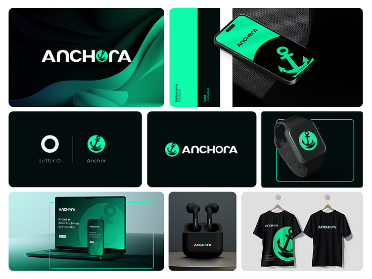
This branding project, titled Anchora, reflects a modern and innovative identity for a brand rooted in reliability and innovation. The visual identity revolves around the theme of anchoring strength and stability while embracing forward-thinking design principles.
Logo Design
The logo creatively integrates an anchor symbol within the letter "O" of the brand name "Anchora," showcasing a seamless blend of typography and iconography. This combination communicates both the brand's core values of trust and its connection to maritime symbolism, all while maintaining a clean and contemporary aesthetic.
Color Palette
The branding employs a bold and vibrant color scheme of neon green and black, evoking a sense of energy and confidence. The neon green suggests innovation and progress, while the black underscores professionalism and sophistication.
Applications
The versatile logo and branding elements are applied across multiple touchpoints:
Digital: Mobile app interfaces, website designs, and digital branding showcase the adaptability of the logo in the tech space.
Merchandise: The branding is extended to physical products such as T-shirts, smartwatches, and earbuds, emphasizing the brand's lifestyle appeal.
Stationery: Business cards and other corporate materials maintain a cohesive brand identity, reinforcing professionalism and brand recognition.
Tagline
The tagline, "Rooted in Reliability, Driven by Innovation", succinctly encapsulates the brand's essence, bridging its dependable heritage with a forward-thinking approach.
This cohesive branding project demonstrates a strong alignment between design, functionality, and brand values, making it both memorable and impactful.


