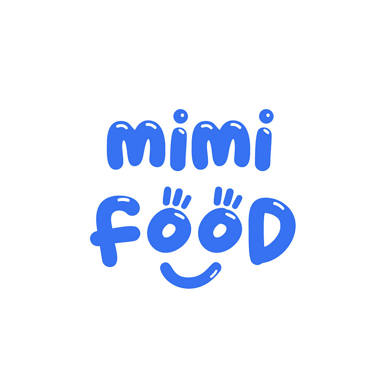
[LOGO DESIGN] MIMI FOOD
[𝗣𝗥𝗢𝗝𝗘𝗖𝗧] 𝐒𝐇𝐎𝐖𝐂𝐀𝐒𝐄 𝐌𝐈𝐌𝐈 𝐅𝐎𝐎𝐃 𝐋𝐎𝐆𝐎 𝐃𝐄𝐒𝐈𝐆𝐍
--------
Logo | Branding | Brand Identity
Field: Fast food restaurant
--------
Mimi Food's logo brings a sense of joy, closeness and energy, clearly showing the friendly spirit of the brand. The letters are designed in a rounded, soft style, creating a comfortable and accessible feeling for customers. In particular, the logo uses creative stylization: the characters in the word "food" are combined with the image of a smiling face, creating a cheerful and friendly feeling at first sight. The main blue color is eye-catching, attractive, has a positive meaning, evoking trust and youthfulness. With a funny, playful design, the Mimi Food logo is like a friendly invitation to all customers.
Designed by Kaiza
Copyright © Kaiza. All Right Reserved
Contact us:
KAIZA CO.,LTD
• P: 0889 996 399
• E: info@kaiza.vn
• W: www.kaiza.vn
Connect me @ Behance - Instagram - Pinterest


