Microlearning App Visual System
In this post, I'm sharing the style guides and components I designed for the Azhman micro-learning app. 🌟
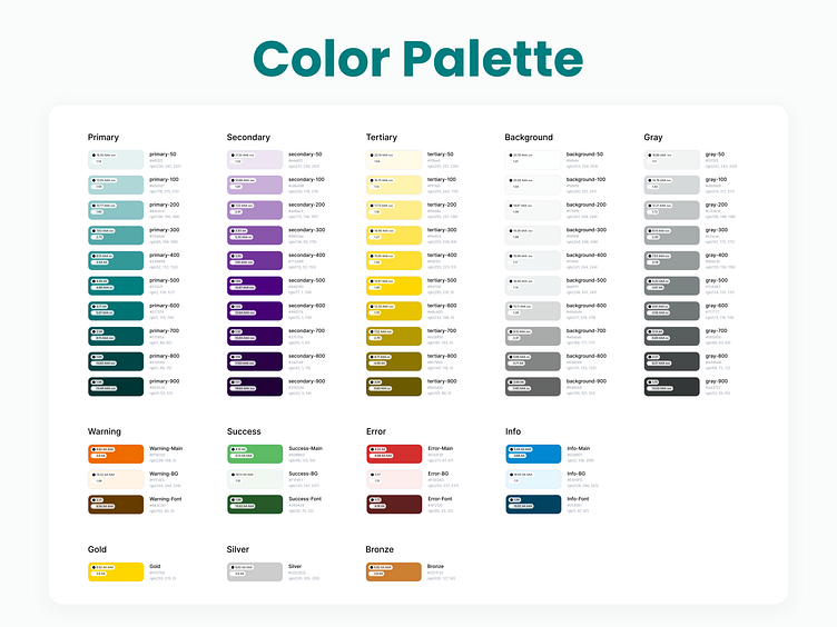
🔹 Color Palette
The primary color is a blend of blue, symbolizing professionalism, and green, representing growth. For the secondary color, I chose a shade of purple, reflecting wisdom and adding a harmonious contrast. To balance the cool tones, I introduced a warm accent color to keep the visuals engaging and avoid user fatigue. Neutral and semantic colors are also included for a comprehensive palette.
🔹 Icons
The icons are selected from the iconsax pack, showcasing only the ones used in this app.
🔹 Typography
The app uses the Danaa Typeface, a modern, elegant, and legible font, tailored for both mobile and tablet screens.
🔹 Components
Here, you can see some of the key components designed for this app, reflecting simplicity and functionality.
Thank you for visiting 💎
-----------------------------
New project? Cool, let's have a chat. 👩🏻💻


