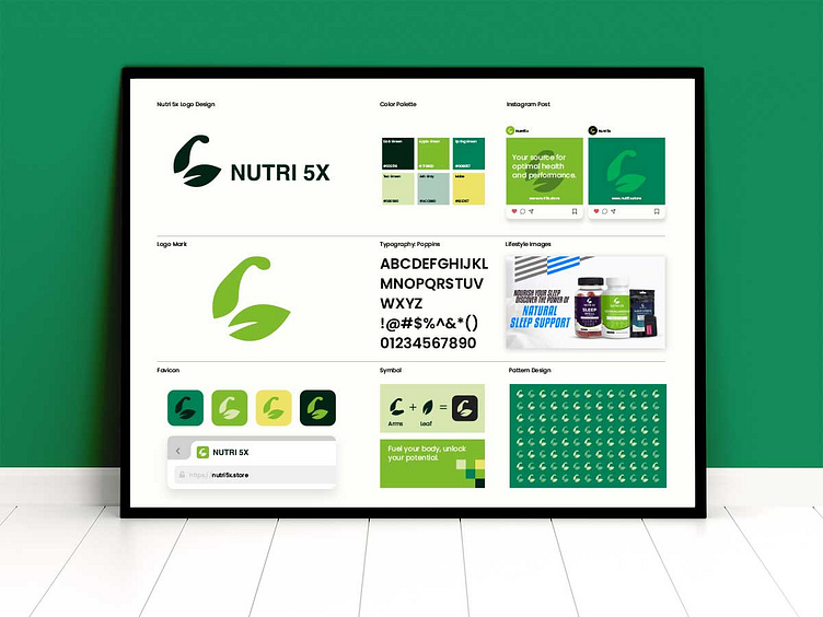
Nutri5X: Energizing Fitness Nutrition Logo Design
Client Review - Ahmad"This logo is the perfect representation of our fitness nutrition brand. It’s dynamic, strong, and truly aligns with our vision. Excellent work!"
Nutri5X Branding: Challenges & Design Approach
Overview Nutri5X is a fitness nutrition brand focused on providing high-quality supplements designed to fuel athletes and fitness enthusiasts. The goal was to create a logo that communicated strength, vitality, and a healthy lifestyle.
Challenges
Energy and Strength: The logo needed to visually convey the brand's focus on performance, energy, and vitality.
Brand Differentiation: The design had to set Nutri5X apart from the abundance of fitness nutrition brands in the market.
Versatility: It was essential for the logo to work across various platforms, from product packaging to digital promotions.
Design Approach
I used bold typography combined with a dynamic emblem symbolizing movement and power. The "5X" element was stylized to create a sense of energy and force, while the color palette of vibrant green and black signifies health, strength, and endurance. The clean lines and modern typeface ensure the logo remains timeless and adaptable.
The result is a powerful, modern logo that represents Nutri5X’s mission to fuel fitness enthusiasts with top-tier supplements.
