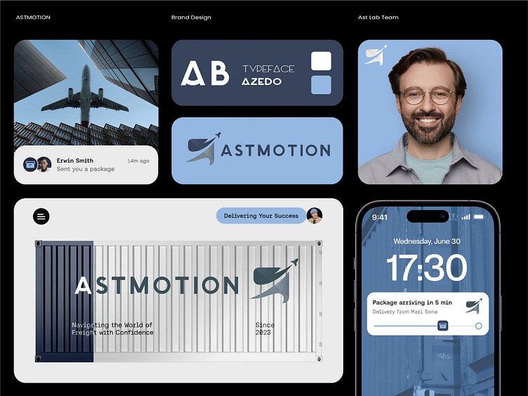
Astmotion: Dynamic Logo Design for a Courier Service
Client Review - Erwin Smith"The logo perfectly reflects the speed and reliability of our courier service. Outstanding creativity and execution!"
Astmotion Branding: Challenges & Design Approach
Overview Astmotion is a courier service dedicated to providing fast, reliable, and efficient delivery solutions. The logo needed to encapsulate the company’s core values of speed, trust, and professionalism.
Challenges
Dynamic Representation: Capturing the essence of motion and speed in a unique yet straightforward design.
Brand Memorability: Ensuring the logo would be easy to recognize and recall in a competitive logistics market.
Scalability: The logo needed to perform well on vehicles, packaging, and digital platforms.
Design Approach
The design features a dynamic and streamlined symbol, inspired by the flow of a delivery route and the concept of motion. A bold sans-serif typeface adds a sense of strength and reliability, while the integration of sharp angles conveys speed. The color palette combines vibrant orange for energy and progress with deep navy blue for trust and stability.
The final design is a modern, versatile logo that reinforces Astmotion’s commitment to delivering excellence in courier services.
