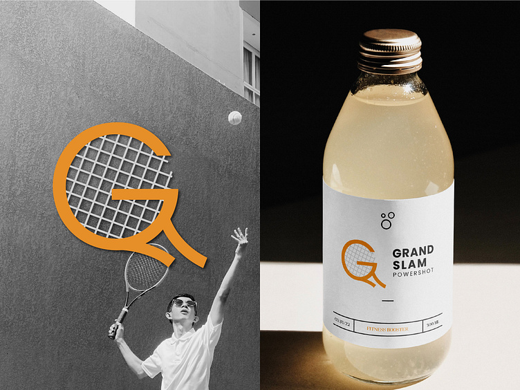
Grandslam: Energetic Logo for a Tennis Supplement Brand
Client Review - Que"The logo is vibrant, energetic, and captures the essence of our brand perfectly. Outstanding work!"
Grandslam Powershot Branding: Challenges & Design Approach
Overview Grandslam Powershot is a tennis supplement brand aiming to fuel athletes with performance-enhancing nutrition. The logo needed to encapsulate the energy, precision, and competitive spirit of tennis while appealing to a fitness-oriented audience.
Challenges
Dynamic Representation: The logo had to evoke energy and motion, reflecting the high-intensity nature of tennis.
Brand Differentiation: It was crucial to stand out in the sports supplement market while maintaining a clear connection to tennis.
Modern and Sporty: Balancing a modern aesthetic with a sporty vibe to appeal to a wide demographic of athletes.
Design Approach
I centered the design around dynamic elements like a tennis racket and ball, seamlessly incorporated into the typography to symbolize action and focus. A bold, sans-serif font was chosen for a sporty and modern look. Vibrant green and energetic orange hues were used to convey vitality and performance, while maintaining strong brand recall.
The result is a powerful, energetic logo that resonates with Grandslam Powershot’s mission to empower tennis players at all levels with superior supplements.
