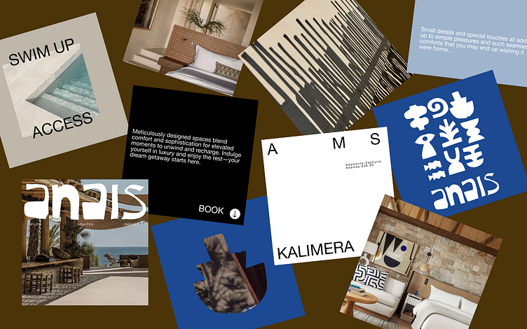
Anais Milos Suites - Brand Posters
In the rebranding of this boutique luxury hotel, the brand’s initials A, M and S take on an emboldened role in deliberately framing collaterals, forming layouts that are subtle yet impactful. Collateral designs utilise a systematic, grid-based system that organise information in a logical manner. This is contrasted with playful hand drawn graphics in a similar ‘cut-out’ style as the primary logo for greater brand affinity. The inclusion of the iconic Greek blue within the Anais colour palette reminds one of traditional Cycladic homes that incorporate blue-painted doors into their typology.
More by Jerica Liew View profile
Like
