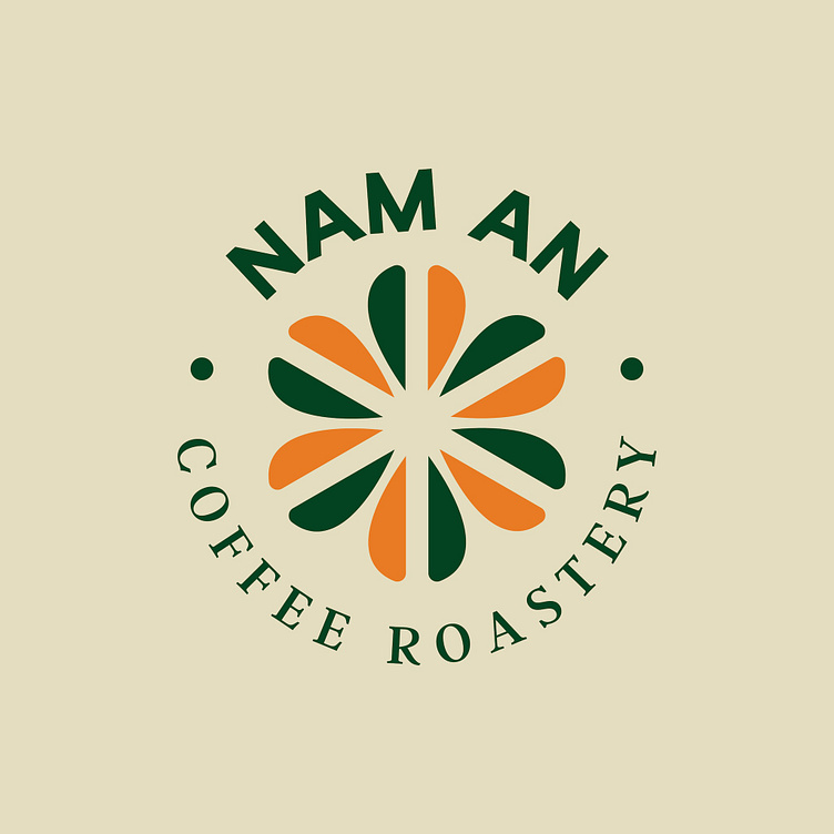
[LOGO DESIGN] NAM AN COFFEE
[𝗣𝗥𝗢𝗝𝗘𝗖𝗧] 𝐒𝐇𝐎𝐖𝐂𝐀𝐒𝐄 𝐍𝐀𝐌 𝐀𝐍 𝐂𝐎𝐅𝐅𝐄𝐄 𝐑𝐎𝐀𝐒𝐓𝐄𝐑𝐘 𝐋𝐎𝐆𝐎 𝐃𝐄𝐒𝐈𝐆𝐍
--------
Logo | Branding | Brand Identity
Field: Coffee shop
--------
The logo of Nam An Coffee Roastery was designed by Kaiza in a natural and rustic vintage style. The serif font, a classic font with a nostalgic feel, creates a friendly and intimate space, true to the style of a coffee shop with an old style. The flower symbol made from coffee beans inside the logo not only brings aesthetics but also shows the connection and harmony of the most important ingredient - Coffee. The two rustic green and dark orange colors, reminiscent of the color of coffee leaves and coffee beans after roasting, emphasize the quality of the original coffee flavor that Nam An Coffee Roastery wants to bring to customers.
Designed by Kaiza
Copyright © Kaiza. All Right Reserved
Contact us:
KAIZA CO.,LTD
• P: 0889 996 399
• E: info@kaiza.vn
• W: www.kaiza.vn
Connect me @ Behance - Instagram - Pinterest


