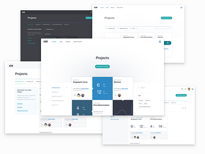
Projects Dashboard
This shot is part of a project that I’ve worked on in early 2015.
Once we had the structure, I started exploring various visual design directions that would not just embrace the brand values but help users to accomplish their tasks.
Some of the concepts that were produced during the exploration phase are shown in this shot, ranging from a dark theme to a modern grid layout.
The idea behind the concept in the centre, was to transition seamlessly from the landing page to her personal dashboard once she’s logged in. In a way, parts of this design would have functioned both as a landing page and dashboard of the actual product.
Eventually, we moved forward with a direction that’s still visual but keeps the emphasis on functionality.
Please make sure you check the attachment.
Available for freelance work!

