SanDisk New Logo ReDesign
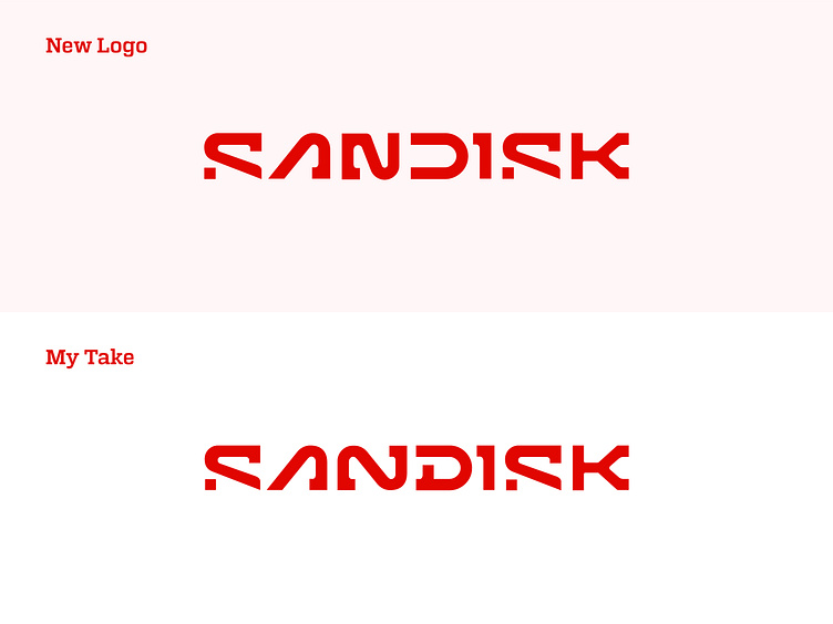
The recently redesigned SanDisk logo caught my attention with its bold and modern aesthetic. However, I noticed a subtle imbalance in the "N" and "D" characters, which seemed to disrupt the overall flow of the design. As a designer, I believe every detail matters, especially in a wordmark representing a global brand.
In my take on the redesign, I refined the "N" and "D" to create a more harmonious and balanced look. The adjustments focus on aligning the proportions and visual rhythm of the letters, ensuring a smoother transition between them. These subtle changes enhance the legibility and symmetry of the logo while preserving its bold and contemporary appeal.
The result is a more cohesive and polished wordmark, delivering a stronger visual impact. Let me know your thoughts—do you think these refinements improve the design?
Your brand’s story starts with its logo!
Let’s make it
unforgettable!
DM me or send an email
your next iconic logo is just a message away!
👉 daudhasan313@gmail.com
👉You can get my service on 👉 Linkedin
Or 👉 Freelancer.com
📖Read my Client's Recommendations
👍 Follow me on Instagram
👍Check out my Behance profile
👍 Follow me on Twitter
👍 Follow me on Pinterest
