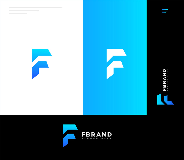
F Letter Logo: A Powerful Choice for Brand Identity and Recognit
Why Choose an "F" Letter Logo?
1. Simplicity and Memorability
One of the biggest advantages of using a single letter, such as "F," as a logo is simplicity. A streamlined, single-letter logo is easy to recognize, remember, and reproduce across various media. Its clean design allows it to fit effortlessly on business cards, websites, social media profiles, and product packaging without cluttering or overwhelming the viewer.
2. Versatility and Adaptability
An "F" letter logo is highly adaptable to different styles and industries. Whether you're in fashion, finance, technology, or hospitality, the letter "F" can be crafted into a versatile design that fits the brand's tone. From minimalist designs to elaborate typography and symbols, the "F" letter logo can evolve and adapt to suit any aesthetic.
3. Instant Brand Recognition
The simplicity of a single-letter logo can help establish a strong brand presence. When designed effectively, an "F" letter logo can quickly become a brand’s defining feature. Think of global brands like Facebook, which have successfully leveraged the simplicity of a single letter to enhance brand recall and familiarity. A well-crafted "F" logo has the potential to reach similar levels of recognition.
The Power of Typography and Style in "F" Letter Logos
An "F" letter logo’s appeal often lies in the choice of typography and style. Here’s how different elements can influence the design:
1. Typography and Font Choice
Font selection is one of the most impactful choices when designing an "F" letter logo. Serif fonts convey tradition, authority, and sophistication, making them ideal for brands in finance, law, and consulting. On the other hand, sans-serif fonts exude modernity and simplicity, which are perfect for technology companies, startups, and lifestyle brands. Additionally, handwritten or cursive fonts can lend a touch of elegance and individuality to a luxury brand’s logo.
2. Custom Letter Shapes and Geometric Designs
Customizing the shape of the letter "F" to include unique geometrical elements or abstract forms can add depth and creativity to the logo. These adjustments allow the logo to become an instant visual symbol of the brand. For example, an "F" logo designed with sharp, angular lines may symbolize precision and strength, while a more rounded, flowing "F" can evoke warmth and approachability.
3. Colors and Meaning
Color plays a significant role in logo design, as each color carries different connotations. Black, gray, and silver are often associated with sophistication and professionalism, while blue conveys trustworthiness and stability. Brighter colors like red or orange can bring energy and enthusiasm, suitable for a vibrant, dynamic brand. The choice of color should align with the brand’s personality and the message it aims to communicate.
4. Adding Visual Elements
Sometimes, integrating small icons or symbols into the "F" letter can enhance its storytelling potential. For instance, a tech brand may incorporate subtle circuit lines within the letter, while a nature-focused company could include leaf-like accents. These small visual touches can make the logo more distinctive and reflective of the brand's core offerings.

