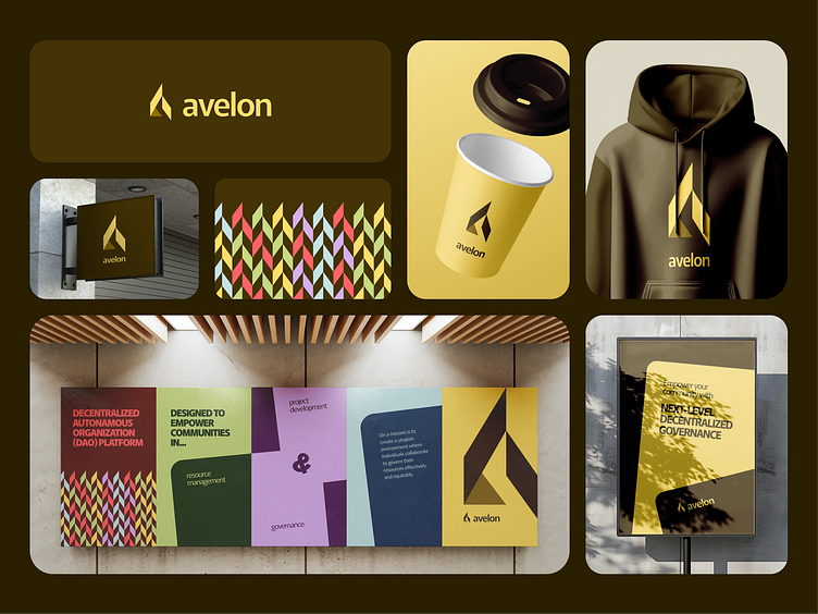
Avelon Introductory Case Study
Introduction
Avelon is a decentralized autonomous organization (DAO) platform designed to empower communities in resource management, governance, and project development. Avelon's mission is to create a utopian environment where individuals collaborate to govern their resources effectively and equitably. This case study outlines the branding process, design decisions, and visual identity developed for Avelon.
Understanding the Brand
Avelon’s unique proposition lies in its seamless integration of advanced blockchain technology with user-friendly governance tools. The platform’s target audience includes:
- Blockchain enthusiasts looking for collaborative tools.
- Community leaders aiming to manage resources effectively.
- Organizations seeking transparent and decentralized decision-making solutions.
Core Brand Values:
1. Empowerment: Enabling communities to take ownership of their governance processes.
2. Transparency: Building trust through openness and accountability.
3. Innovation: Pioneering new ways to collaborate and solve problems.
Design Approach
Color Palette:
Avelon’s color palette was selected to balance vibrancy and professionalism, reflecting both the technical and human aspects of the platform:
- FDDD6B (Golden Glow): Represents optimism and creativity.
- 443305 (Earth Brown): Conveys stability and grounding.
- 551A5E (Royal Plum): Highlights innovation and sophistication.
- D7AFEB (Lavender Mist) & C5E3E5 (Sky Blue): Add softness and approachability.
- 004063 (Deep Teal): Reflects trust and authority.
- FF6367 (Rosy Red): Adds energy and dynamism.
- 650000 (Crimson): Symbolizes passion and boldness.
- C7D983 (Soft Green) & 0D3F07 (Forest Green): Represent growth and sustainability.
Typography:
Murecho was chosen as the brand’s primary typeface for its modern and geometric structure. Its clean lines and high readability make it ideal for both digital and print applications, ensuring consistency across various mediums.
Logo Design:
The logo design is an:
- Abstract shapes that formed a stylized "A" that signifies aspiration and advancement.
Visual Elements:
Abstract patterns were developed to depict collaboration and interconnectedness. These elements enhance the brand’s storytelling, making it relatable and visually engaging.
The Avelon Experience
The branding for Avelon extends beyond visuals to create an experience that resonates with its audience. Whether it’s through a website interface, marketing materials, or social media content, Avelon’s identity speaks to the heart of its mission: empowering communities to govern their future.


