Challenge #023 - Onboarding Screens | Daily UI
Challenge #023 - Onboarding Screens | Daily UI
Thrilled to share my 23rd challenge for the Daily UI: a Travel App Onboarding UI! 🌍✈️
Here’s a closer look at the design details:
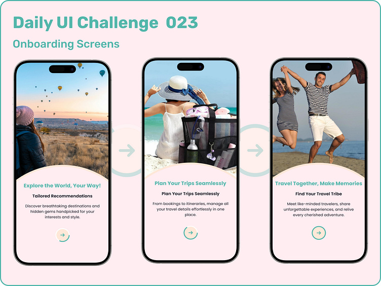
🔹 Progressive Next ButtonThe circular "Next" button features a stroke that dynamically fills counter-clockwise as users progress through the onboarding. This subtle visual cue ensures users always know how far along they are in the journey.
🔹 Clean and Focused LayoutEach screen highlights a key feature of the app with concise text, relevant subheadings, and visually engaging imagery. The use of auto layout ensures seamless spacing between elements for a polished design.
🔹 Theme & Color PaletteA soothing travel-inspired blue dominates the palette, offering a light and refreshing vibe that resonates with the app’s purpose.
Intentional MinimalismBy omitting "Skip," "Next," and "Get Started" text-based CTAs, the design emphasizes a distraction-free and modern onboarding flow.
🔹 Screen Highlights
1️⃣ Explore the World, Your Way! – Tailored recommendations for unique destinations.
2️⃣ Plan Your Trips Seamlessly – Manage all travel details effortlessly in one place.
3️⃣ Travel Together, Make Memories – Connect with like-minded travelers and share unforgettable experiences.
🎯 Key Features:
Visually intuitive navigation with progressive feedback.
Clean typography and layout for clarity.
Balanced visual hierarchy to guide users smoothly.
Excited to hear your feedback on this design! Let’s connect and collaborate on more creative projects. 🚀
