Kuraina Real Estate Branding


Kuraina Real Estate Branding
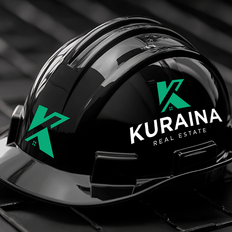
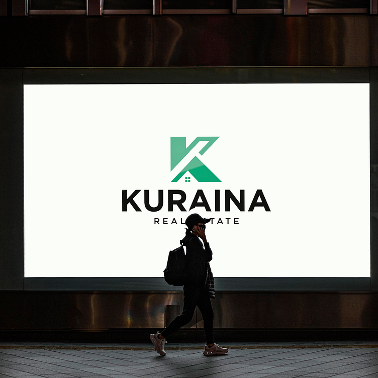
🚀 We’re thrilled to share this sleek and modern brand identity created for Kuraina Real Estate! This project focuses on creating a bold and professional presence, perfectly blending trust and elegance for a global real estate brand.
Key Elements:
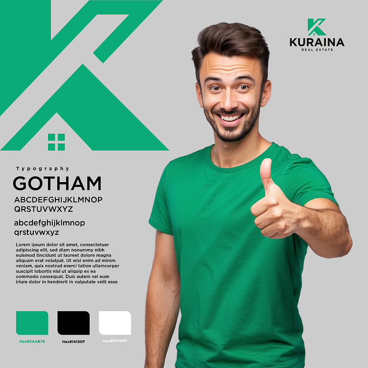
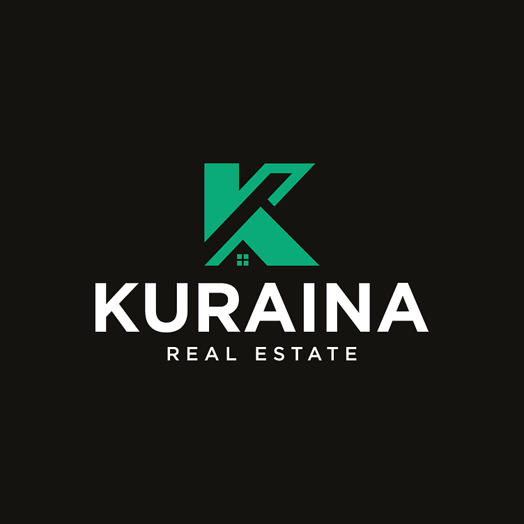
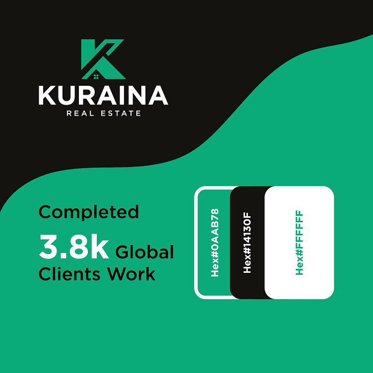
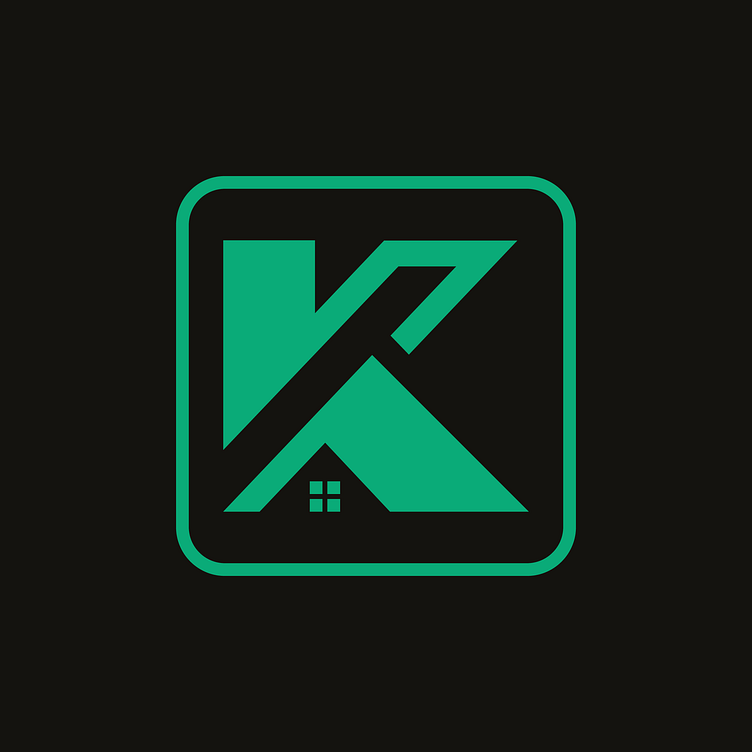
✅ Logo Design: A dynamic “K” symbol integrated with a subtle house icon, symbolizing trust and home. ✅ Color Palette:
Primary Green: #0AAB78 🌿
Supporting Black: #14130F ⚫
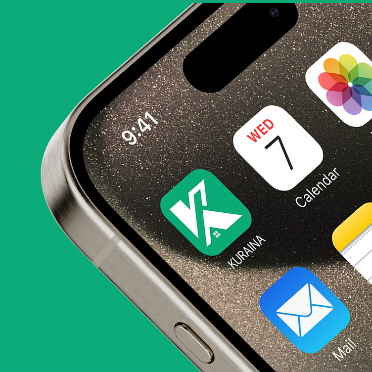
Clean White: #FFFFFF ⚪ ✅ Typography: Clean, bold sans-serif for a sharp, professional appeal. ✅ Versatile Mockups: Showcasing the logo in various applications, from signage to mobile apps.
📊 Achievements: Completed 3.8k+ global client projects, building dreams worldwide!
📩 Have a similar project in mind? DM me for collaborations.
Don't forget to Press 🧡 if you like it!
Interested in working with me:
Get in touch with me:
WHATSAPP | BEHANCE | LINKEDIN | INSTRAGRAM
