Red Dot Website Revamp
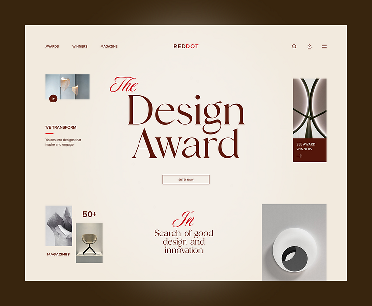
This UI design is our experimental take on the Red Dot award website.
Here we focused on the following aspects while reimagining it -
Minimalist Aesthetic: The clean, uncluttered layout emphasizes elegance and sophistication, aligning perfectly with the essence of design excellence.
Typography Focus: The large, stylish typography creates a strong visual hierarchy, drawing attention to key elements like "The Design Award."
Strategic Visual Balance: The use of whitespace, imagery, and text blocks maintains harmony, making the interface visually appealing and easy to navigate.
Big shout out to Muhammed Imran for the brilliant idea and execution behind this!
More by COdesign View profile
Like
