LOYACOS | LOGO DESIGN & BRAND IDENTITY
Among the booming wave of cosmetic surgery, fillers, and Botox, people inadvertently overlook the true value of natural, sustainable beauty. And then, at a challenging and modest crossroads, Loyacos was born. Without fanfare, without chasing fleeting trends, Loyacos chose a different path — one filled with challenges but also the future of the beauty industry.
Loyacos began with a love for skin — a love for oneself, as encapsulated in the brand's message: "Love yourself, love your skin." Loyacos does not aspire to follow the well-worn paths of the crowded cosmetics market. To compete with the "giants" of the beauty industry, Loyacos entrusted Bee Art's Design Team with a significant mission from the very beginning: to create a logo that is not only luxurious and outstanding but also embodies the brand's spirit of naturalness and credibility.
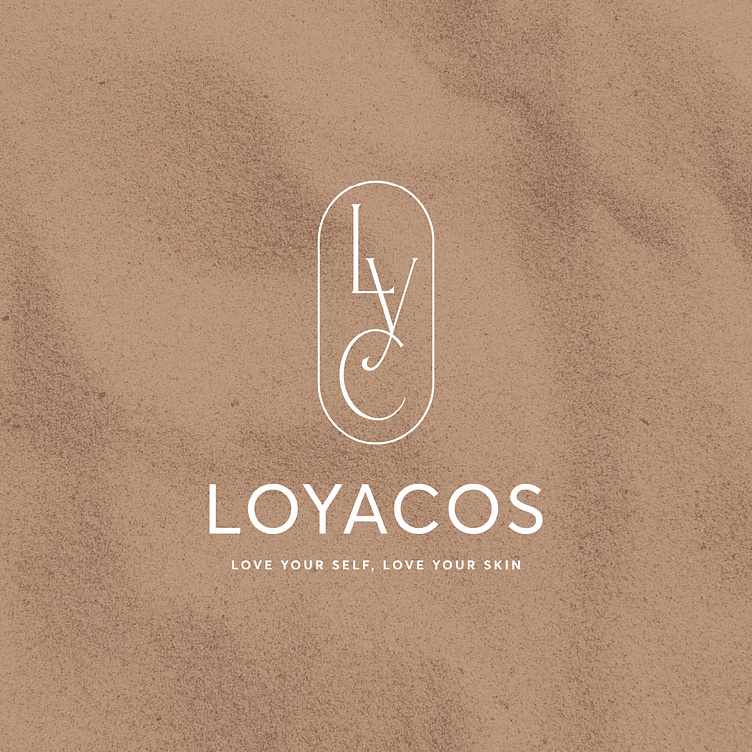
In the design process, adhering closely to Loyacos's requirements, we stylized the letters "LYC" into a soft and minimalist form within a balanced, enclosed emblem — reminiscent of an arch sheltering and cherishing the beauty of the skin. Paired with a metallic silver hue — a symbol of modernity and purity — the visual identity is captivating enough to make an impression while maintaining a subtle, understated elegance.
Designed by Bee Art
-
Client Loyacos
Logo Design Project. Logo is designed for Cosmetic brands.
Copyright© Bee Art. All Right Reserved
Contact us:
• Hotline/ Zalo: (+84) 77 34567 18
• Email: info@beeart.vn
• Website: www.beeart.vn


