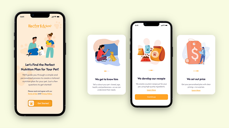
Redesign Concept - Case Study
UX/UI Proposal for the User's Homepage & Consultation Funnel (Mobile Version)
Redesign Hector Kitchen's homepage once the user is logged in with a fun, modern, and easy-to-use design, creating an engaging experience that matches the brand's focus on personalized pet nutrition, while making the page feel welcoming and intuitive for users.
Design Approach:
Playful, cute design using pastel colors, rounded corners, and illustrations to create a friendly vibe and a modern feel.
Simplified content with interactive elements to improve usability and navigation.
Modern and fresh aesthetic inspired by wellness apps, to make the page feel welcoming and engaging.
Duration: 25 hours total
Benefits – Key Features
This redesign offers a cleaner, more engaging experience with personalized pet care, simplified navigation, and transparent product details. It enhances trust through clear, concise information and gamification, keeping users motivated and connected with their pet’s journey.
_____________________________________________________________________________________________________________________________________
I'm always open to new opportunities and collaborations!
📩 Contact me: carolinaorozcoromo@gmail.com
📷 Instagram: @caro.orozcor


