Reimagining Accessible Crypto Payments
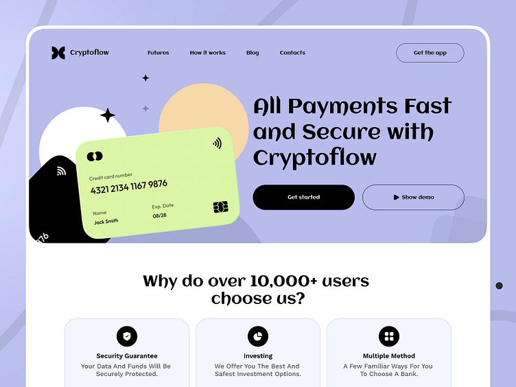
At Tino, our goal was to create a web experience that translates complex financial operations into an approachable visual narrative. Starting with a light, friendly color palette, and clean typography, we established a welcoming environment that reduces intimidation for first-time crypto users.
Our design decisions were informed by extensive research and testing, revealing the importance of clarity and trust. We employed generous white space, simplified iconography, and large, legible headings to help users quickly grasp key features—whether reviewing transaction histories, exploring investment options, or securely linking payment methods.
Subtle vector illustrations and soft, rounded forms lend a human touch to the interface, ensuring users feel supported rather than overwhelmed. We also built a modular design system that can adapt to emerging needs, scaling seamlessly as new functionalities, currencies, or security enhancements become available.
Ultimately, this concept reflects our commitment to user-first design. By prioritizing transparency and friendliness, we’ve developed an experience that encourages engagement, learning, and comfort in the evolving world of digital finance.
Do you want to create something great? Feel free to contact us - 📩 anastasia@tino.design
Our Website - https://tino.design/


