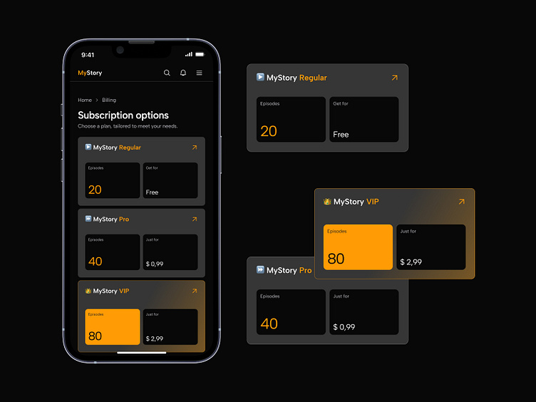
Subscription page designs for mobile app
I created two designs to show how colors and layout can really affect how people feel and make decisions. By comparing these designs, we can see how important visual elements are in guiding user behavior.
Both designs offer subscription options for the "MyStory" mobile app. The first design uses a dark-orange color scheme, while the second one has a light-blue palette. Both are modular in style, but the second one is more minimalist.
The content is the same in both designs, but the styles give different vibes.
The dark-orange design feels more suited for E-Commerce or Entertainment apps.
The light-blue design seems better for Healthcare, Education, or Finance apps.
By carefully choosing colors and layouts, you can greatly influence how users perceive and interact with your app. Consistent colors make things clear, while bright accents draw attention to important details.

