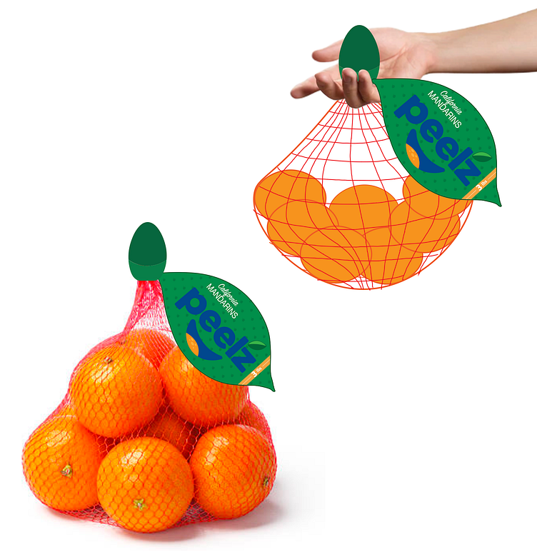
Peelz Package Redesign
This is a practice design for a "Package Design" course I took at my university surrounding sustainability. I took the basic packaging of a mandarin company named "Peelz" and designed packaging which would give the bag the look of an orange, helping it stand out on a grocery shelf (looking like a supersized representation of it's own product). This design would also make the action of carrying the bag much more comfortable by providing a plastic ball, of sorts, which would fit into your palm as the bag hangs between your fingers. This plastic ball would also have the capability to reel in the fish netting once all the fruit has been eaten using a "twist and reel" mechanism inside, allowing for the polythene waste to be much easier to recycle.


