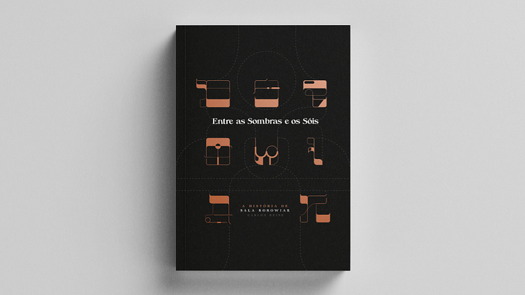
Between the Shadows and the Suns - Book Design
Between the Shadows and the Suns (Entre as Sombras e os Sóis, Carlos Reiss) went through a very beautiful creation process. From briefing meetings, ideations and references, to the incessant and tireless sketches and layout tests I did. Conversations with Carlos about Sala and reading the book made me dive into the story and intensely feel the experiences described. I realised that something very important was about to be released.
The story is inspiring and I am happy to have been part of the project. Sala was a strong woman who faced all the barbarism, torture and Nazi persecution. By overcoming traumas and demonstrating her strength, she came to Brazil and built her family after the difficult and inhumane moments in concentration camps. Carlos (her grandson) narrates Sala's legacy masterfully. This work took more than twenty years to be written. Its rich content, with historical research, documents and excerpts of real speeches, shows us the facts in a detailed and engaging way.
The entire graphic design project – cover letterings, chapter numbers, maps, layout and photo compositions – was done in 2022. The dashed lines, compositions and letterings were inspired by sewing sketches, Sala's hobby. The lines connect, reminiscent of the stitching of the stories that Carlos Reiss documented masterfully, like a historical embroidery. The types mix the aesthetics of Hebrew typefaces with the dashed markings of sewing sketches, forming a modern and elegant design that reaches and dialogues with different audiences. Another interesting point about the design is that it seeks to perpetuate the memory of the Yiddish and Hebrew languages, through the chapter names written in the corners of the pages and at the chapter openings, with original typographic alphabet. One of the most important things for the culture of a people is their native language and thus, we seek to continue education for future generations. The colours (black, orange and variations of hues) refer to "shadows and suns". Bringing neutral colours, representing the shadows and warm colours, representing the children (or the suns, an analogy present in the book) and the beginning of a new phase. Like the dawn, with its orange tones that come colouring the day.
A special thanks to Laura Nicolli and Carlos Reiss. Thank you for the attention, engagement, briefing, appreciation of the work and patience with the busy context of work and life at the time. We have completed this project, which I hope will resonate for a long time, not only in terms of design, but also caring for and educating generations, with this beautiful story of perseverance and resilience.


