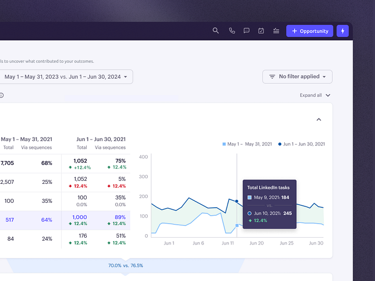
Sales funnel report
Some time ago, I worked on the final iteration of the Sales Funnel Report. The goal was to create a clear visualization for comparing data across two timeframes, whether for prospects or team performance. This allows users to see how they are pacing, identify what’s working, and spot areas for improvement by viewing the data in a broader context.
You can find more details about the feature in the article.
Let me know if you like it or if you have any suggestions!
More by David Jambor View profile
Like

