Pat Tillman Foundation: logo and campaign design
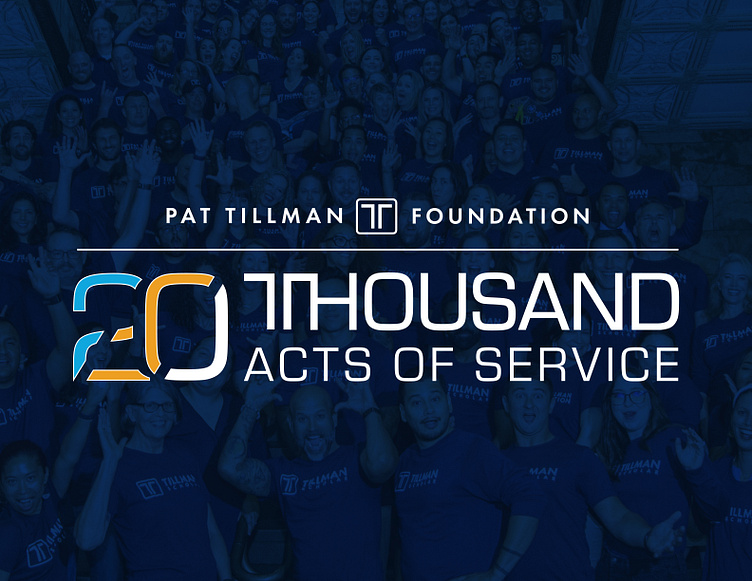
How does one arrive at a final design for a new logo? When working with the Pat Tillman Foundation’s 20th anniversary campaign, we went back to where it all started, Pat and his legacy.
Not only did we create a new logo for the Pat Tillman Foundation but we also collaborated with the team to name their anniversary campaign. Ultimately the logo decided upon incorporates the campaign’s name, introduces a new color inspired by Pat’s football jersey, subtly incorporates the foundation’s signature 'T' mark and features the number 20, broken into sections to create negative space like the waving of the American flag.
To celebrate the 20th anniversary on its own, we took the same 20 and brought it into the existing logo, connecting 20,000 Acts of Service to this milestone for years to come. This thoughtful detail reflects the themes of unity, service, and leadership, grounding the campaign in its roots while looking forward to its growing impact.


