Apollon.fi - Case study

I teamed up with the Apollon crew to give their crypto wallet a fresh look. The goal? Build trust, make the platform easy to use, and set it up for future success. I delivered a cohesive brand identity, scalable UX/UI, and extensive Webflow development to make it all happen.
My role covered everything from creating the brand identity to designing an intuitive app and implementing a versatile Webflow solution. Every step focused on aligning with the brand’s professionalism and delivering a user-friendly experience that felt reliable and ready to scale.
The results?
A scalable app design, a cohesive brand identity, and a robust Webflow implementation that’s simple to maintain – all aligning seamlessly with Apollon’s vision.
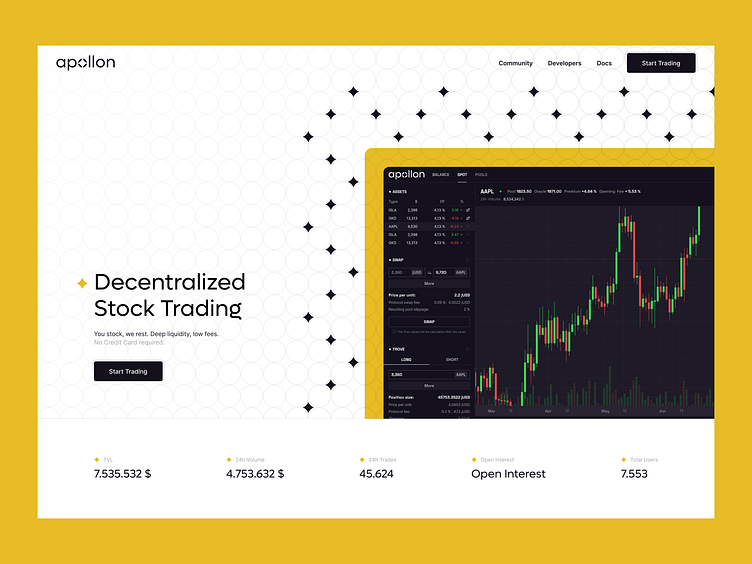
Where the Platform Stood and What Needed Fixing
Apollon.fi is a crypto wallet built to help users trade easily, no third parties required. While it had a solid foundation, it lacked the cohesive branding and user-friendly design it needed to make a real impact in a competitive market.
On top of that, the app needed to feel seamless and easy to use, delivering a smooth experience for users right from the start. To tie it all together, I created a scalable Webflow solution that matched the brand’s vision and made future updates a breeze.
Branding
Research & Ideation
Worked closely with the client to shape the brand’s vision. This involved moodboarding and exploring concepts that captured reliability and innovation.
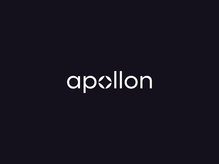
Logo Design
Created a standout typographic logo with the letter "O" as a spark of light, symbolizing guidance and brilliance. Circular elements brought in a sense of stability and trustworthiness.
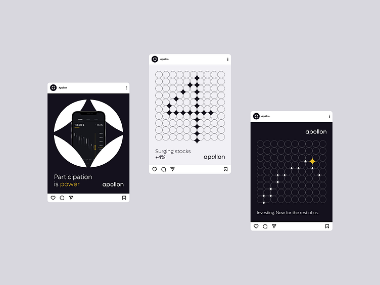
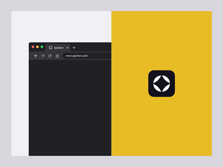
Color Palette & Visual Style
Developed a sleek palette of black, white, and deep purple-blue to communicate trust, intelligence, and authority across the board.
Speaking of key branding elements, including the logo, color scheme, and communication strategy, I cooperated with the Escalate Ltd creative studio.
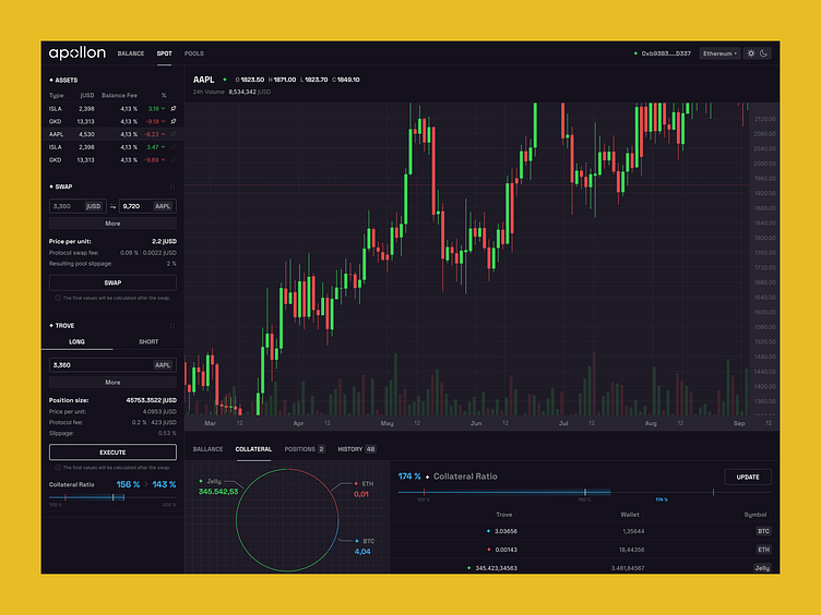
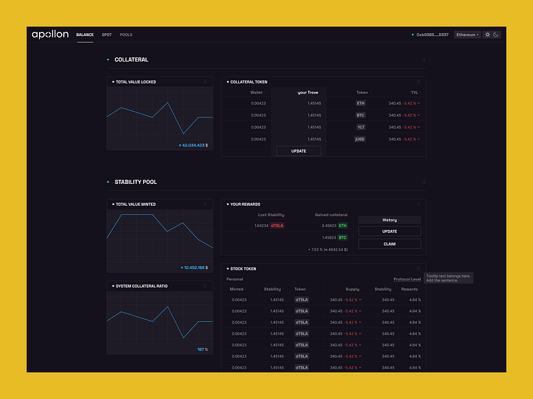
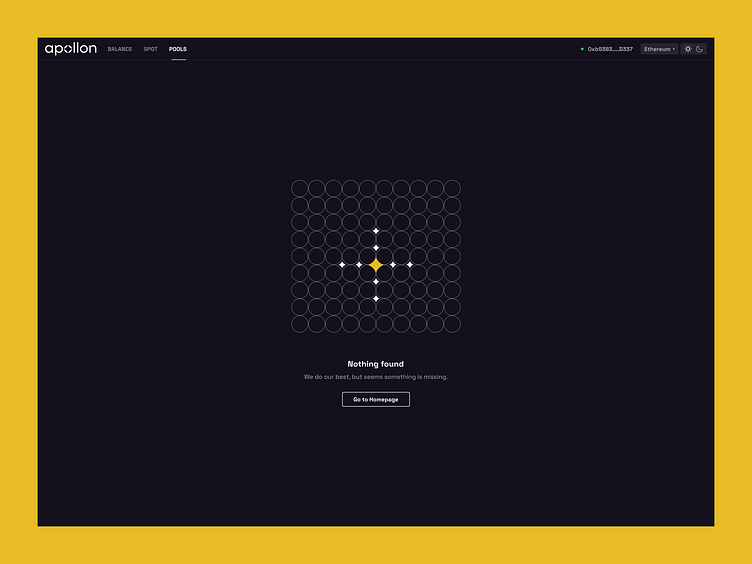
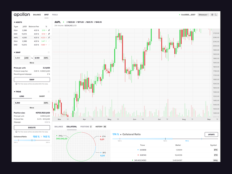
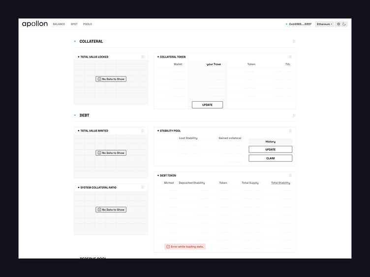
App Design within a Small Design System
Tokenization & Modes
Built a lightweight design system that included tokenization for smooth updates and support for both dark and light modes.
Component-Based Approach
Designed modular components to make scaling and development easier.
User-Centered Focus
Created an intuitive layout with clear navigation, reducing friction for users.
Web Design + Webflow Development
Brand Alignment
Ensured the new brand identity was seamlessly integrated into the platform, from typography to color accents.
Lightweight and Easy Maintenance
Delivered a lightweight, well-structured solution, making updates straightforward and hassle-free.
Interested in Working Together?
Let’s talk about your next project! Whether you need help with user-centered design, scalable solutions, or a full UI/UX overhaul, I’m here to bring your ideas to life. Let’s create something impactful together.
User Experience Design & Interface Design
Wireframing and Consultations
Design System Development
…and much more!
DM me here on Dribbble!