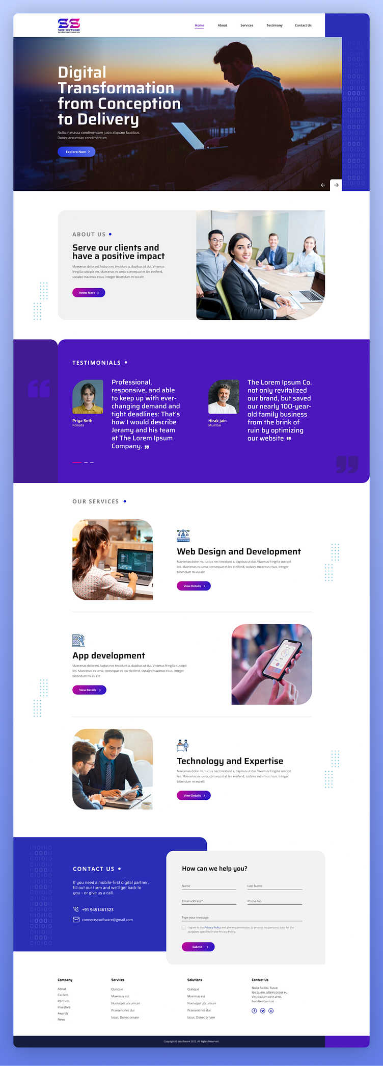
Website design for tech company
Some key points on the layout ✏️
⏺️ Form Placement: The contact form is prominently positioned at the bottom, ensuring accessibility for users seeking to reach out.
⏺️ Clarity and Simplicity: The form fields are clearly labeled, with a structured layout (Name, Email, Phone, and Message), making it easy for users to navigate and fill out.
⏺️ Call to Action (CTA): A well-defined "Submit" button is prominently placed, encouraging user engagement.
⏺️ Data Privacy: The inclusion of a privacy agreement checkbox adds trust and transparency.
⏺️ Visual Hierarchy: The form uses contrasting colors and white space effectively to stand out within the section, ensuring it is visually distinct yet cohesive with the overall design.
⏺️Responsiveness: The design elements suggest adaptability for both desktop and mobile views.
