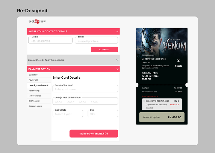
Payment Screen
🎨 Redesigning for Confidence and Seamless Experiences
I recently redesigned the BookMyShow payment screen, focusing on two critical areas in the ticket details section:
1️⃣ Lack of Event/Show Images: I noticed that the absence of visuals could leave users uncertain about their ticket selection. To solve this, I integrated event/show images directly into the ticket details. This small yet impactful change: ✔ Provides visual confirmation, boosting user confidence. ✔ Reduces hesitation and builds trust. ✔ Encourages seamless purchase completion.
2️⃣ Hidden Seat Number Details: In the mobile app, seat numbers are not displayed upfront and require users to click on a CTA to view them—adding unnecessary steps to the flow. To improve this: ✔ Seat numbers can be displayed directly in the ticket details. ✔ This saves users from a lengthy process and provides instant clarity, enhancing their experience.
✨ The takeaway? Small design tweaks like these can significantly improve usability, reduce friction, and create a smoother, more engaging experience for users.
Have you encountered similar challenges when redesigning for user confidence? Share your thoughts or experiences!
💡 #UIDesign #UXDesign #BookMyShow #UserExperience #DesignThinking #DailyUI


