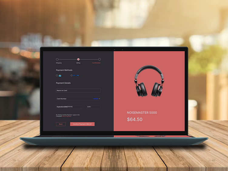
UI Challenge Day 2- Checkout Page
The Day 2 UI Challenge features a modern and user-friendly checkout page. The layout is clean and well-organized, with the left side dedicated to payment details and progress tracking, while the right side highlights the product image and price. The bold red "Confirm Payment" button naturally grabs attention, guiding users to take action. The overall design feels simple yet polished, making the checkout process smooth and visually appealing.
Key Learnings:
1. Using contrasting colors helps focus the user's attention on important actions like payment confirmation.
2. Splitting the layout between product details and payment information keeps things clear and easy to navigate.
More by Tanishq View profile
Like

