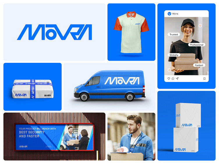
MOVRA - Delivery, Logistic Service Logo & Branding
About MOVRA
MOVRA is a wordmark logo. The logo's letters are placed close to each other to represent the relationship between the company and the customer. The last 3 letters (VRA) are joined together, and it represents the shape of a road. The letters are placed diagonally to represent speed.
Do you have any project ideas?
Let's shape your ideas Into memorable identities.
I'm available for new projects.
Feel free to contact- helloabedinjoy@gmail.com
More by Abedin Joy View profile
Like


