Fitness app concept
Design of a minimalist fitness app inspired by Apple Fitness.
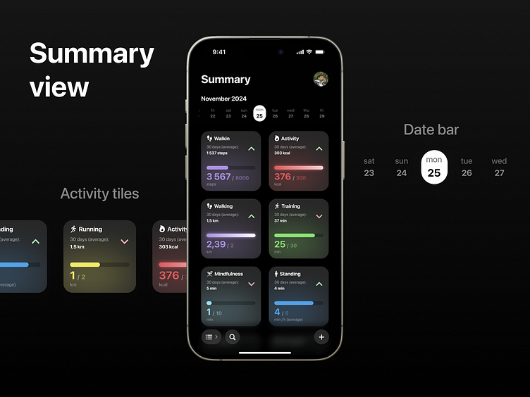
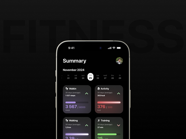
At the top of the summary screen is a date bar, for selecting a specific day. It is there because it is a natural place for general information, which can include the date. It is not an easily accessible place, but changing the date is not an option that is used most often.
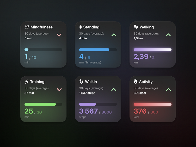
Below are the activity tiles. They are square-shaped to accommodate as much information as possible, allowing you to fit more items on the screen. Each tile has its own accent color, allowing you to quickly identify the item you are looking for. However, the colors are quite soft and unsaturated, which does not cause visual overkill or inconsistency. Each tile has a summary of the most important information about the activity, such as the trend, the average for the last 30 days and, most importantly, the status of the goal, on the selected day. This is the most important information, which is also clearly emphasized by the color, size and thickness of the font.