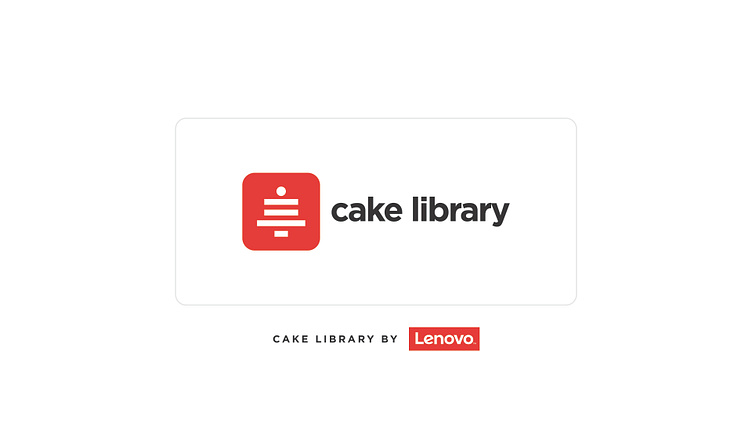
Design System Library - Logo design
The Issue
Needed a logo for its new "Cake Library," a collection of reusable design components that streamline the design and development process. The challenge was creating a visual identity that represented the concept of "cake" and the idea of a "library of components." The logo needed to convey modularity, creativity, and cohesion while being simple, memorable, and versatile across different platforms and mediums.
The metaphor of a cake was central, as cakes are made up of distinct layers and pieces that combine to create something greater than the sum of their parts. Similarly, the Cake Library serves as a repository of individual components that come together to form cohesive designs. The primary goal was to capture this dual essence in a single logo.
The Solution
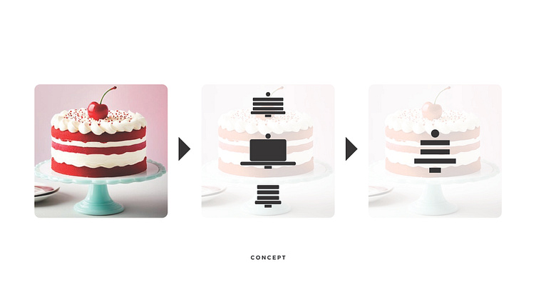
To address the challenge, I drew inspiration from the visual and symbolic elements of a cake. My initial concept revolved around the classic imagery of a cake on a pedestal, emphasizing celebration and craftsmanship. I then deconstructed this image, transforming the cake into a modular structure made up of squares to reflect the library's component-based nature. The cherry on top served as the perfect accent, symbolizing excellence and attention to detail.
Through iterative design, I explored various alternatives, from abstract depictions of cakes to more literal interpretations. Each iteration aimed to balance the playful and professional aspects of the brand. After rounds of refinement, I finalized a logo that features a multi-layered square cake topped with a cherry. The design’s geometric shapes suggest modularity, while its balanced composition conveys reliability and cohesiveness.
What I Had to Do
Creating the Cake Library logo required a multi-step process:
Research:
Understanding the Cake Library’s purpose and target audience.
Analyzing visual trends in tech branding and design libraries.
Studying cake imagery and symbolism to align with the brand’s message.
Concept Development:
Brainstorming ideas that combine "cake" and "library of components."
Sketching initial concepts to explore different directions.
Logo Creation:
Translating sketches into digital mockups.
Experiment with shapes, colors, and typography to achieve the right balance.
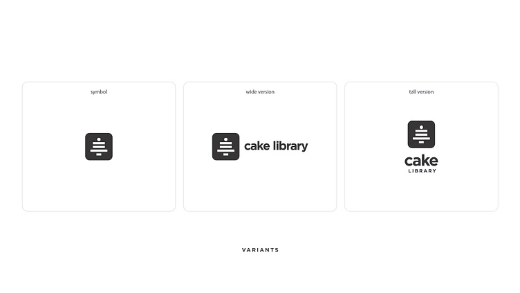
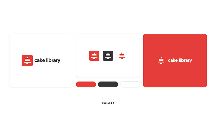
Logo Variants:
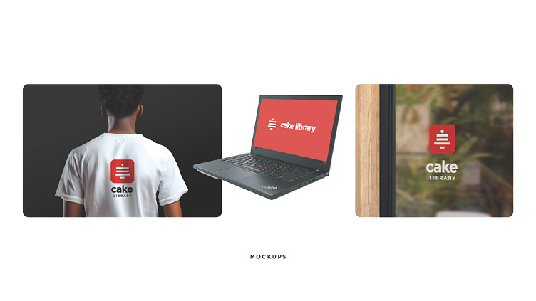
Creating alternate designs for different use cases (e.g., square, horizontal, monochrome).
Testing scalability and adaptability for digital and print mediums.
Final Assets:
Delivering the logo in various formats (SVG, PNG, EPS) and resolutions.
Providing a style guide outlining logo usage, color palette, and typography.
Outcome
The final logo successfully encapsulated the essence of the Cake Library. Its modular cake structure visually represented the library’s component-based system, while the cherry on top added a touch of personality and refinement. The design has been well-received internally, symbolizing collaboration and innovation within the design ecosystem.