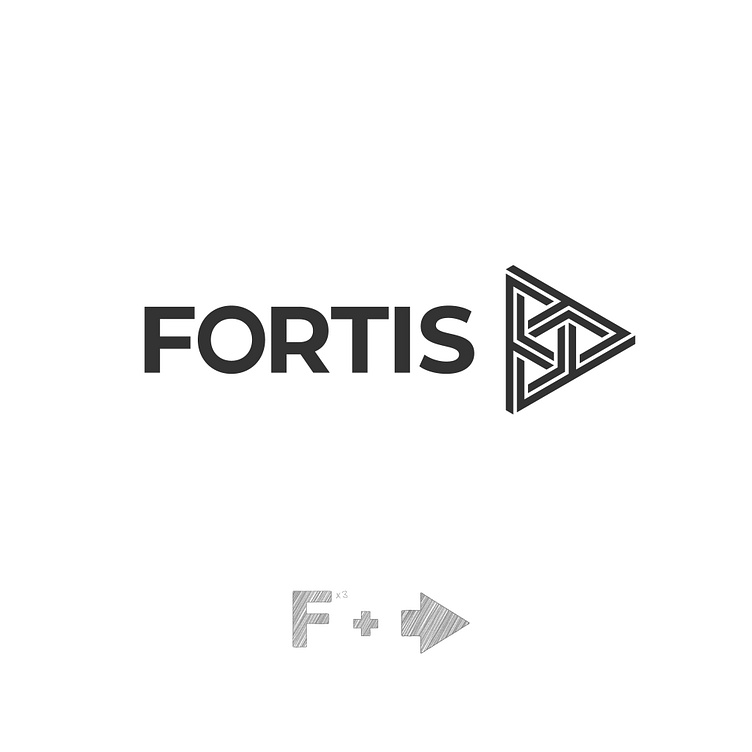
Fortis Logo
BRAND:
Fortis Asset Management delivers sustainable investment solutions, blending financial growth with environmental responsibility. Specializing in wealth management, it targets European investors seeking ethical, long-term value creation.
CHALLENGE:
Fortis redefined its brand identity to meet growing demand for sustainable investments. Market research revealed a preference for value-driven brands, inspiring a bold, modern design to appeal to clients and investors.
SOLUTION:
The logo mark, featuring three interlinked “F” letters forming a triangle, symbolizes strength, unity, balance, and legacy, fostering trust and collaboration between clients and their investments. The rebranding solution updated Fortis’s identity with bold geometric shapes and a logo exuding clarity and versatility. Its timeless simplicity ensures adaptability across media, balancing creativity with function.
Client: Fortis asset management
Year: 2020
Service Category: Logo, Brand Identity
Designer: Gints Apsīts (Graphic Design, Art Direction)
Creative Director & Copywrite: Ingus Josts
Agency: F'n'S
#logo #brandidentity #graphicdesign
