Analysing Linkedin Application
Analysing User Experience (UX)
This time, I have decided to analyze this popular application in terms of UX, visual design, and UI design and provide some recommendations.
In general, LinkedIn is a simple and user-oriented application that allows the user to quickly and easily access the desired information. Its focus on career and job search and talent search is very evident.
This application is beneficial for finding job opportunities in all countries and geographical locations and creating professional and international connections.
Strengths points
* It is possible to easily search for the desired job of the user.
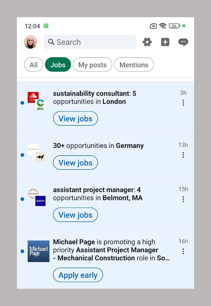
* In the Jobs section, appropriate and relevant job suggestions are provided according to the user's recent searches.
* This application is highly structured in such a way that it offers suggestions to communicate with other people in the desired career and professional field of the user according to the user's search and skills, and this makes the user able to communicate with more people in his professional field. establish.
* In different parts of the application, such as Chats, Jobs, Notifications and Network, very efficient and suitable categories have been created, which makes it easier for the user to reach the desired destination.
* In terms of accessibility, this application has been designed as a website in both desktop and mobile versions and supports different languages.
Weak points
* Using this application for people who use it for the first time and want to create an account and fill in their information through the application may be confusing and boring, because the user is presented with a large amount of information and features at once. It shows that the user does not have enough information about them.
* In the Home section, the purpose of presenting and displaying posts is based on the posts that people who are connected with the user (Network) have liked or left comments on, not based on the activity (posts) of the people with whom the user is directly connected. This causes the user to face a set of unhelpful information and lose his motivation to see posts and spend time in this part of the application.
* Even though the jobs, people and posts suggested by the Application are often suitable for the user's profession and searches, there are still unrelated suggestions of people, jobs and posts.
* A series of very useful and advanced features of this application cannot be used without payment and this can cause disappointment in using this application.
* Although there are interactive features such as likes, comments and shares in this application, it lacks unique features to make it more attractive and popular compared to other platforms such as Twitter or Facebook.
* Notifications like 'someone has viewed your profile' may be unnecessary and annoying.
Suggestion and solution
* Adding step-by-step guides or tutorials for new users can help them get to know key features faster and easier.
* Creating a new feature like "Beginner Mode" with limited features and simplified navigation can prevent new users from getting bored and confused.
* Enhance algorithms that prioritize content that matches individual user preferences and professional goals to avoid less relevant or irrelevant offers.
* .Job search filters can be enhanced by adding advanced filter options such as flexible working hours, company size or company stability.
* Add features such as polls or comments to encourage users to participate and interact more.
* "Professional focus" mode can be added to filter posts based on selected professions.
Analysing User Experience (UX)
Strengths points
* Simple and professional design focused on work and networking.
* The tangible and professional use of primary and secondary colors (blue, gray and white) that creates uniformity and visual beauty.
* The icons and buttons are in the right size and in the right place, which makes the path to the goal smoother for the user.
* The menu bar at the bottom of the screen provides quick and easy access to essential features such as Home, Network, Notifications, and Jobs.
* Proposed notifications are provided at the right time and in the right form and size.
* Advanced filters in the Jobs section are very useful and practical in finding the desired job of the user according to the user's skills and interests in his desired location.
Weak points
* The presence of a gray space (in light mode) above the Home page creates the feeling for the user that it is not at the top of the page and it is possible to have more posts at the top of the page.
* In addition to the Home page, this space also exists above the Network and Jobs pages, which is unnecessary and misleading.
* Since blue is the main and well-known color of Linkedin, this color is used less in the application than the size of the colors.
* The presence of videos both in the Home section between posts and in the Videos section is unnecessary due to their use in this application.
Suggestion and solution
* We can use the space above the Home, Jobs and Network pages that can help for a more beautiful visual effect and to avoid confusion for the user.
* Using more colors, especially blue, can be useful in separating and simplifying information and categories.
* If the videos are removed from the posts, the repetition of duplicate content will be prevented and all of them can be displayed in the same video category.


