Omnatura: Branding the Future of AI-Powered Agriculture
Small-scale farmers, often excluded from the benefits of mechanized agriculture due to high costs, face significant challenges in competing with wealthier agribusinesses. Omnatura emerges as a transformative force, bridging this gap with AI-powered farming machinery and a vision of sustainable, accessible agriculture. To build Omnatura’s brand identity, we created a visual and narrative language that captures the essence of innovation, sustainability, and empowerment, while resonating with a diverse global audience.
Understanding the Brand Essence
Omnatura is more than a company—it’s a mission-driven initiative to redefine agriculture as a sustainable and inclusive ecosystem. With AI precision, IoT technology, and blockchain transparency at its core, Omnatura empowers farmers to thrive economically while adopting environmentally friendly practices. This intersection of cutting-edge technology and sustainability became the foundation of the brand’s identity.
The Logo’s Meaning
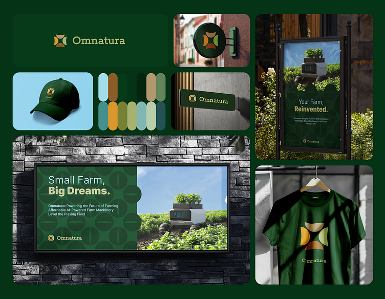
The Omnatura logo embodies the heart of the brand’s mission. Designed as a monogram of the letter ‘O,’ the logo is formed by four leaf-like shapes.
• The Leaves represent growth, connection to nature, and the interdependence of farmers, technology, and the environment.
• The Circular Shape conveys unity, inclusivity, and Omnatura’s commitment to sustainable agriculture.
• The Color Palette draws from nature and innovation, combining earthy greens, warm browns, and accents of gold to symbolize growth, trust, and technological advancement.
The design is minimalist yet deeply symbolic, creating a logo that is not only visually appealing but also meaningful and adaptable across various platforms.
Crafting the Visual and Narrative Identity
The branding process for Omnatura was shaped by its mission to empower farmers while embracing innovation. Each design choice reflects this dual focus:
1. Color Palette: A harmonious mix of greens, browns, and gold tones evokes a sense of trust, growth, and connection to the earth.
2. Typography: The use of Rokkitt, a modern serif font, brings a balance of technology and approachability, aligning with the brand’s essence.
3. Visual Language: Patterns made up of leaf-like shapes.
4. Messaging: Empowering and optimistic, the brand’s tone emphasizes collaboration, innovation, and a sustainable future.
Setting the Stage
Omnatura’s brand identity captures its mission to revolutionize agriculture for small-scale farmers. The logo and accompanying design system balance innovation with inclusivity, creating a visual language that feels both cutting-edge and grounded in the values of sustainability and empowerment.
This case study showcases the foundation of a brand built not just to provide solutions but to act as a catalyst for growth, resilience, and meaningful change in the agricultural sector.


