[LOGO DESIGN] EASY COOK
[𝗣𝗥𝗢𝗝𝗘𝗖𝗧] 𝐒𝐇𝐎𝐖𝐂𝐀𝐒𝐄 𝗘𝗔𝗦𝗬 𝗖𝗢𝗢𝗞 𝗟𝗢𝗚𝗢 𝐃𝐄𝐒𝐈𝐆𝐍
----
🟢 Logo | Branding | Brand Identity
🟢 Field: Household appliances
----
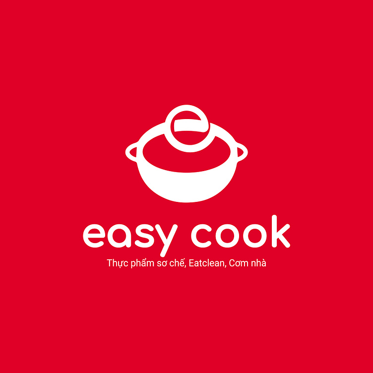
Easy Cook's logo is designed with the image of a pot with a round lid, creating a cozy and close feeling, symbolizing family meals or healthy, easy-to-cook meals. This symbol helps customers easily associate with cooking, suitable for the brand's pre-processed food service and Eat Clean. The pot lid is designed in the shape of the letter "e", cleverly linked to the brand name "Easy Cook", creating uniformity and easy recognition.
The red color symbolizes speed, helping to associate with the convenient cooking solutions that Easy Cook brings. The typeface used is sans serif, round, soft, showing friendliness and accessibility.
Overall, this logo design emphasizes convenience, friendliness, and evokes the warm image of delicious family meals that do not take much time.
Designed by Kaiza
Copyright © Kaiza. All Right Reserved
Contact us:
KAIZA CO.,LTD
• P: 0889 996 399
• E: info@kaiza.vn
• W: www.kaiza.vn
Connect me @ Behance - Instagram - Pinterest


