[LOGO DESIGN] MIEN SPACE
[𝗣𝗥𝗢𝗝𝗘𝗖𝗧] 𝗠𝗜𝗘𝗡 𝗦𝗣𝗔𝗖𝗘 𝗟𝗢𝗚𝗢
----
🟢 Logo | Branding | Brand Identity
🟢 Field: Coffee Shop
----
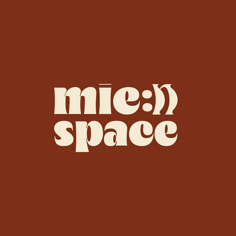
🎨 The Mien Space coffee shop logo was designed by Kaiza to stylize the brand name, expressing a fun, liberal and creative style. Kaiza chose a bold sans-serif font, evoking approachability and comfort, suitable for a coffee space where people can relax and chat. The letter "mien" is stylized with the letter "n" into a smiley face, clearly conveying a cheerful and optimistic spirit. This is a creative highlight, reminding customers of the fun and comfort that they will experience here.
🎨 The light cream logo on the earthy brown background brings a warm, rustic feeling, while also recalling the color of coffee and the closeness to nature, evoking a cozy, pleasant coffee space.
🎨 Overall, the "mien space" logo clearly shows fun, comfort, and closeness, creating an ideal atmosphere for enjoying coffee and enjoying happy moments.
Designed by Kaiza
Copyright © Kaiza. All Right Reserved
Contact us:
KAIZA CO.,LTD
• P: 0889 996 399
• E: info@kaiza.vn
• W: www.kaiza.vn
Connect me @ Behance - Instagram - Pinterest


