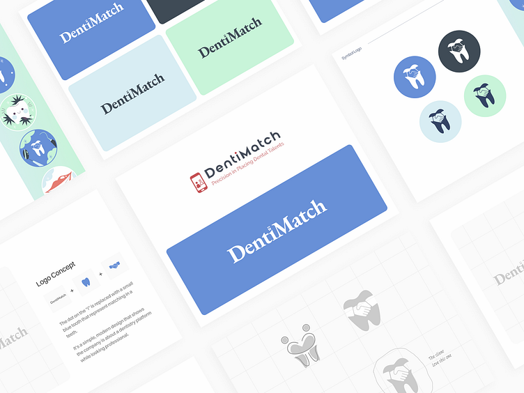
DentiMatch - Logo Concept
The Challenge:
When DentiMatch approached us, they were struggling with a visual identity that didn’t resonate with their audience or represent their unique value proposition. Their old branding, dominated by a red-and-white color palette, felt generic and misaligned with the modern, trustworthy, and professional image they sought to convey.
The existing logo lacked a clear concept, leaving a disconnect between the platform's purpose—connecting dental professionals and practices—and its visual representation. Additionally, their social media presence and overall brand design lacked consistency, making it difficult to create a cohesive and memorable brand experience.
We revamped DentiMatch by focusing on their audience, mission, and role in connecting dental practices and professionals.
Logo Redesign:
Created a modern logo with dental elements and a handshake to symbolize trust and connection.
Color Palette:
Replaced red-and-white with calming blues and greens, representing reliability and growth.
Design Principles:
Prioritized clarity, professionalism, and approachability.
Brand Analysis:
Identified the need for a trustworthy color palette, a connection-focused logo, and consistent digital branding.
Typography:
Used clean, professional fonts for readability, supported by refined icons and patterns for visual consistency.
At Opencore, We Unlock The Power Of Software.
Have a project?
Email as at info@opencoregroup.com or message us on Dribbble.
Follow us on:
Instagram | Linkedin | Facebook | Behance for more UI UX and Web Development content.


